The Ciseal Blog
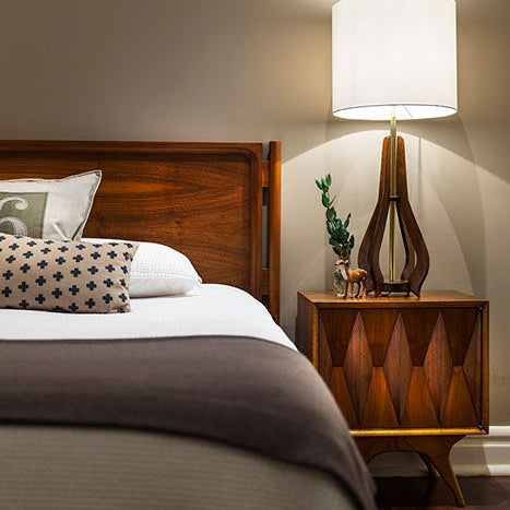
3 Tips for Styling Your Nightstand
A nightstand’s look can make the difference between a calm, quiet reprieve and an anxious, restless sleep. The things you put on it, under it, or next to it are all up to you and the mood you’re hoping to achieve. But how do you create an oasis of a bedside table? There are countless ways to style this small space, but with three simple rules you can easily create a special respite for winding down after a long day.
1. Keep it Simple
Restraint is key - too many things will look cluttered and hardly create a restful atmosphere. But what are the essentials? A lamp is priority in this space (our Michigan Left Lamp is a great choice). Nobody wants to get up from a warm bed after reading a bit to turn off the light. Books can also be important here, and giving yourself a few options depending on your mood will help you wind down after a busy day. Having trouble narrowing it down? A nightstand with a drawer could be your saving grace. Depending on how much space you have left, choose one or two more things to round it out. It could be some art - either on the wall behind your nightstand or a small piece on the table itself, a plant or cut flowers to freshen the air, a candle to set the mood, a special keepsake to bring a smile to your face, or an elegant glass of water will create a cohesive look.

2. Respect the Scale
That ginormous antique lamp from your grandmother is probably not the best choice here and neither is that overflowing Christmas cactus you just can’t seem to tame. Smaller spaces might benefit from wall-mounted lamps - leaving the table itself clear for the other essentials. Smaller photos or artwork are good choices on nightstands and draw the eye to something more detailed and special.

3. Mix it Up
You don’t have keep the same 3 things on your nightstand forever and ever. Play with the things until you love it and then mix it up again. Switching things out every so often keeps the look fresh and interesting and allows you to be a bit more non-committal about what makes the cut in this valuable space. Fresh cut flowers in the spring or a smattering of succulents in the winter are great change-ups. Have a multitude of knick-knacks? Rotate them out every so often. This rule is where the fun is at because you can switch and tweak at will.

It really is that easy! Keep it simple, respect the scale, and mix it up. Try it out and see how much more restful (or exciting) your nights can be!
Are you looking for a fabulous lamp to set the mood? Check out our Michigan Left Table Lamp. It’s my current bedside lamp, and its soft, warm glow is just the restful touch for a calming bedtime routine.

My Journey from STEM to STEAM: Why The Arts are Even More Relevant in a Technology-Driven Economy
If you’ve read past articles in this blog, you’ll know that I sometimes reveal hints of a past life in engineering. It’s true - I spent almost 10 years studying and practicing mechanical engineering. Today, I like to think of myself as a reformed engineer - one who has gone from a complete lack of knowledge about the creative arts to fully embracing the important role art and design have in a technology-driven economy.

My path in engineering started, like most careers nowadays, back in high school. Influenced by the STEM (Science, Technology, Engineering, Math) education movement, the college prep program I attended focused on the liberal arts and sciences while only offering one introductory semester in the creative arts. Being a girl who had a talent for and an interest in math and science, engineering was a natural choice.

Once in college, courses like thermodynamics and machine design left me wondering, “Where's the beauty?” I was learning a lot about how to make things work well and last a long time, but I constantly came back to the desire to learn what it would take to tackle product development in more elegant and sustainable ways. Even after graduating and joining the workforce, I kept asking myself where the human element and the innovation were.

Remembering that I once really enjoyed art classes when they fit into the curriculum, I decided to start taking drawing classes at night to spark that creative side once again. Through these classes, I came across the field of Industrial Design, which would begin to open my eyes to a more wholistic approach to product development. Industrial Design is the first stage of developing a product - from defining the problem to designing how the product will look and feel. Traditionally, products start in Industrial Design to get designed and then get handed off to Engineering to be manufactured.
What I’ve learned from studying and practicing both Engineering and Industrial Design is this: When you ask the right questions and keep in mind the human element to your solution, you can create a product that exponentially improves life by creating a bit of joy with every use. Think about the products you love - not only do they do their job, but they’re beautiful and they have an intention behind every detail that makes using them a joy.

Now, not every engineer needs to become an industrial designer. There are certainly outstanding benefits to an in-depth technical education, and we can all see the amazing advances made as a result of a focus on STEM subjects. What would be beneficial is if our STEM curriculums fostered a mindset of appreciation and collaboration between all of the fields important to a thriving technology-driven economy: Science, Technology, Engineering, Art, and Math (STEAM).

In the end, creating opportunities for Art and Design to be included in STEM programs - for STEM to become STEAM - results in more beautiful, useful products that make our lives easier and more joyful. Wouldn’t it be cool if more of the products we used everyday sparked a bit of joy and put a smile on our face every time we used them?
If you liked this article, be sure to read my follow up: Lessons from STEM to STEAM: Why STEAM is the Path to an Awesome Future.
Creating handmade products that are beautiful and useful are my mission with Ciseal. I like to think that each of my products make life more enjoyable and spark little joy-filled smiles throughout the day. If you're feeling the need for more smiles, feel free to check out Ciseal's current collection.
8 Mid Century Modern Inspired Home Decor Items We're Loving Right Now
It’s no secret that I’m a big fan of Mid Century Modern decor. The clean lines, pops of bold color, and natural materials make my heart flutter a bit at each glance. Each product I design is majorly influenced by the vintage Mid Century decor of the 50’s and 60’s. But I’m not the only one. There are countless others right here in America who are inspired by the mid mod classics to design and make their own take on modern decor today.
That’s why I’m excited to share with you some of my favorite Mid Century Modern inspired home decor items designed and made by hand right here in the USA.
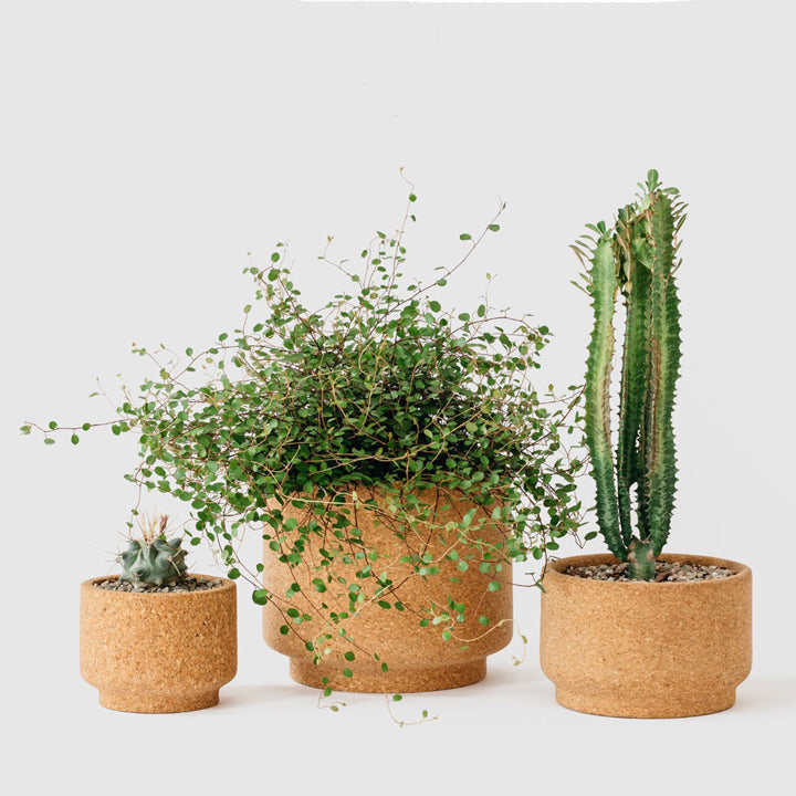
Modern Cork Planters by Melanie Abrantes
These hand-turned cork planters were inspired by vintage planters from the 1960’s. They’re naturally porous, so they keep plants at the perfect moisture level. Melanie makes them available in three sizes for all sizes of houseplants. Take a look at Melanie Abrantes’ online shop.
Perpetual Calendar by Tait Design
Tait Design’s hanging wall calendar is designed to be used year after year. It’s design is inspired by vintage volvelles. The three circles move to mark the day, date and month - perfect for the home or office. Find out more at Tait Design’s online shop.
Walnut Serving Trays by Hunt & Noyer
Fellow Michigan-based designer Kyle Huntoon makes these handsome trays in three sizes for any use you can think of. The small tray is a perfect desk caddy to keep all of your small items in one tidy place. The medium tray holds all of those important pieces of mail or paper together and neatly stacked. And the largest size is made for entertaining - like carrying drink and apps and such. Check them out at Hunt & Noyer’s website.
SQR Box + Sliced Lid by IN.SEK Design
IN.SEK Design specializes in combining natural concrete and wood in clean shapes that complement any mid century modernist’s decor. Their bowls, trays, hooks, and planters are to die for, but I’m particularly smitten about their gorgeous boxes. Each one is a unique design that holds your prized possessions safely and beautifully. Check them out at IN.SEK’s online shop.
Rope Box by Light + Ladder
Light + Ladder’s Rope Box in Walnut hangs from any wall where you want some decorative storage. Hang it next to your front door to store your keys, wallet, or phone while keeping them out of sight. Find out more at Light + Ladder’s online shop.
Modern Birdhouse by KoolBird
So maybe a birdhouse isn't your typical home decor item, but hear me out. KoolBird’s bird houses are modern takes on mid century shapes. Imagine hanging one of these in a child'd bedroom or anywhere that might want a bit of lighthearted whimsy. Find out more at KoolBird’s online shop.
Aspen Magazine Rack by Ciseal
I’d be a bit remiss to not include my most favorite home decor item of all time - The Aspen Magazine Rack. But seriously, this gorgeously modern piece brings a bit of nature-inspired beauty indoors and onto your coffee table or desk. It’s a clean, minimal way to corral magazines, newspapers, mail, documents, or your favorite trinkets and treasures. Check them out in Ciseal’s online shop.
It was tough narrowing it down to eight! These are just a small sample of the mid century inspired home goods that are being made in the USA right now. Whether it’s these talented designer/makers or ones closer to your home, please support your local small businesses!

Gift Guide For the Mid Century Modernist
Mid Century Modern’s resurgence isn’t fading anytime soon, and I'm guessing there’s probably someone in your life who’s a fan. There are so many great mid century gift options today, so I've done my best to narrow it down to some unique products that are sure to be adored. Whether that special someone is obsessed with the classic, retro Mad Men look or they're a fan of the modern, clean mix of natural and industrial decor, there’s something on this list for them.

Vases from Heath Ceramics
$24-122
You cannot go wrong with a Heath Ceramics vase. Just about anyone will cherish one, but MCM fans will truly appreciate their quality and style.

Art Prints from Christian Musselman
$75-$125
Midcentury architecture and design fans love the beauty in the details of their homes. Christian’s home portraits capture these details in a distinct modern style that any midcentury fan will love - even if they don’t live in one of these atomic ranches yet. 
Tiki Mug from Ooga-Mooga
$25+
Mid Century and Tiki are like those friends who are polar opposites but attached at the hip nonetheless. For an interesting look into why they’re such great buddies, check out Tiki With Ray’s blog post here. Suffice it to say, your Mid Century fanatic will probably appreciate a tiki mug or two. Ooga-Mooga is my go-to site to find unique tiki mugs that are both traditional or super irreverent and silly if that's your jam. 


Books! These are some of my favorite books with gorgeous photos and lots of info and history. Like any good Mid Century Modernist, I can get lost in these for hours.
Michigan Modern: Design that Shaped America $35
Eames: Beautiful Details $42
Miller’s Mid-Century Modern $45
Alexander Girard: popular edition $52 
The Ray Tablet Stand from Ciseal
$80
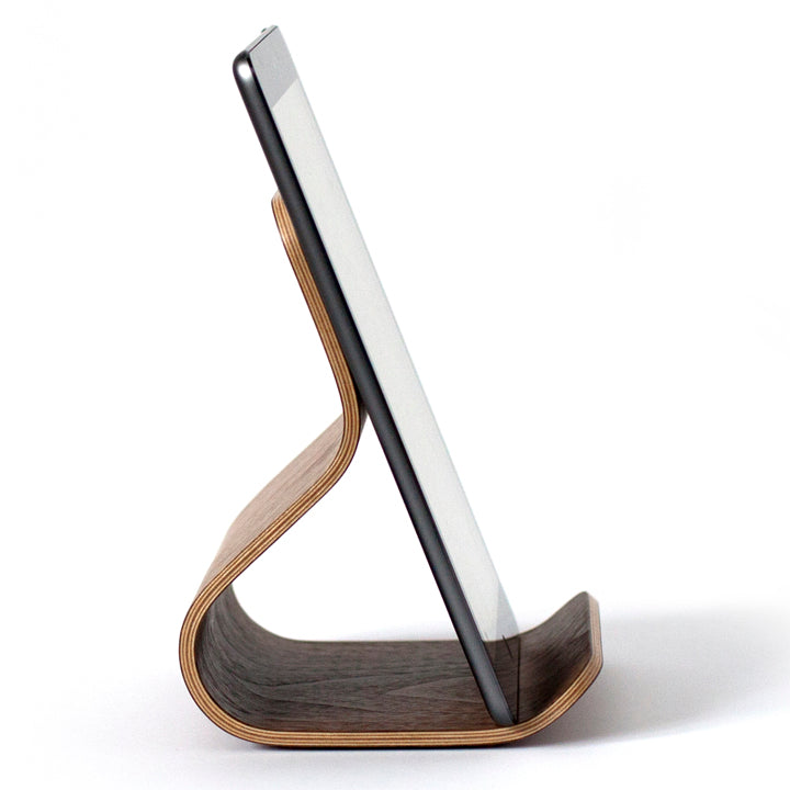
Named after Ray Eames and inspired by the Eames LCW bent plywood chair, these handmade bent plywood stands are designed to hold your iPad, cookbook, magazine, and more at a perfect viewing angle while you work, read, cook, play, and watch. 
Tree Ring Paintings by focus.line.art
$35+
Artist Tracy Melton’s mid century inspired, rustic, yet modern wood slices may be my new best friends. I can imagine them perfectly accenting a quaint mid century lake house. Each piece is one of a kind, hand painted by Tracy himself, and would add some fab rustic modern charm to your mid century fan’s home.

Prints from Jenn Ski
$35+
Jenn Ski’s gorgeous prints feature retro atomic-era abstract patterns in bright, modern bursts of color. Be sure to check out her other products too - there's sure to be one that's the perfect match. 
The Yard Bird from Lunar Lounge
$50
Inspired by Charles and Ray Eames, these handmade birds add that mid mod natural touch to any room.

Trilogy Tray from David Rasmussen Design
$83
Harken back to when it was considered a bonding experience for the family to gather around the tv with their trays of tv dinners. The Trilogy Tray is a modern take on those tv dinner trays, and it brings a nostalgic touch to serving appetizers, nuts, or chocolates at your next dinner party. Check out the other products available too - there are literally so many your MCM fan will love.
Modern Family tree from My Tree & Me
$55-120
My Tree and Me creates custom modern family trees. The clean, modern designs are available in multiple color options that will go perfectly with mid century modern decor.
Wire Trophy Heads from Bend Goods
$60-220
No hunting necessary - these wire trophy heads bring nature home with a touch of fun modern style. 
The Philip Johnson Glass House Snow Globe from The Glass House Design Store
$75
Is there anything more tranquil than gently falling snow? This snow globe is custom made for the Glass House Design Store, and it’s a nostalgic take on a modern icon.

Hans Bolling Wooden Duckling Stardust Modern
$78-$148
Try to resist this simply adorable duckling hand crafted out of teak wood. It’s smooth, simple, playful yet sophisticated curves are sure to bring some harmony and warmth wherever it’s placed. 
Aspen Magazine Rack from Ciseal
$120
The Aspen Magazine Rack's aspen leaf inspired sweeping bent plywood profile is a perfect addition to any mid-century modern lover's coffee table.
Five Must-Have Midcentury Furniture Designs for Your Home
Midcentury furniture is characterized by clean lines and inventive contours, and the right midcentury pieces can add timeless sophistication to any space. There’s a thriving trade in midcentury antiques today, with Palm Springs a renowned midcentury mecca, but several furniture design firms have begun to recreate popular midcentury pieces using high-quality materials. In this post, we’ll look at some iconic midcentury items for your home.
Eames Plywood Lounge Chair and Ottoman

Photo Credit: Manhattanhomedesign.com
Midcentury furniture designers were fascinated with smooth, flowing lines, shorn of the elaborate ornamentation of earlier design eras. With its futuristic curves and burnished wooden surfaces, this plywood lounge chair and ottoman, based on a design by Charles and Ray Eames, is a stellar example. This piece also displays midcentury design interest in contrasting textures, with a rich wooden frame balanced by luxurious leather upholstery.
Florence Chair

Several renowned midcentury designers created chairs using this ultra-minimalist compound cube template. This pioneering version was devised by Florence Knoll in 1954, and similar designs are often known as “Florence Chairs.” This design reduces the basic shape of the armchair down to a few spare lines without sacrificing comfort. The cube shape can balance with almost any interior arrangement, adding solidity without dominating a room. Shown here in classic black, cube chairs can also be found in bright contemporary colors like scarlet or burnt orange, making them a perfect accent piece for a neutral palette.
Bentwood Coffee Table

Photo Credit: Glicksfurniture.com.au
Midcentury designers sought to emphasize functionality without sacrificing visual interest or structural refinement. This Swedish modern bentwood coffee table is a paradigmatic example – the simple curve of the wooden structure bends back on itself to create a seamlessly integrated magazine rack. With its plain design and texture, this piece makes a versatile addition to your living room, working equally well as a coffee table or side table.
Le Corbusier Dining Table

Photo Credit: Nest.co.uk
Glass-topped tables were all the rage in midcentury interior design, combining futuristic steel with the minimalist clarity of transparent glass surfaces. This Le Corbusier Dining Table originally appeared as the popular designer and architect’s “LC6” design, but it and similar pieces have been re-created as high-quality replicas. Its emphatic lines and strong steel base provide a powerful central focus to any dining room. This piece’s cool steel-and-glass palette also provides the perfect companion to an accent piece – for example, a dramatic light fixture or lively silkscreen print.
Adrian Pearsall Sofa

Photo Credit: 1stdibs.com
Sofas were a midcentury design favorite due to the contemporary craze for casual entertaining. Designer Adrian Pearsall was inspired by yacht and shipboard interiors, and his source material shows in the polished wood ornamentation in his sofas and coffee tables. His low-slung gondola sofas became a midcentury favorite, a sleek alternative to blockier minimalist sofa designs. His original was copied, but never outshown – consider making this original design the hub of your living room.
The midcentury modern era inspired a wealth of innovative furniture, so you’ll have an abundance of options to choose from when selecting furniture for your home. This guide should give you a foundation for your midcentury stylebook. Why not add midcentury flair to your home with one of these visionary designs?
About the Author: Real Estate Unlimited is a premiere real estate agency located in Southern California, serving Echo Park and nearby neighborhoods. We pride ourselves on our in-depth local historical and cultural knowledge, ensuring that all of our clients are matched with the perfect home in the perfect area. We are passionate about delivering the best service to all of our clients, finding each purchaser a truly unique Southern California home.

6 Estate Sale Tips to Find the Vintage Mid Century Modern Furniture You Crave
Estate sales are the place to be if you’re looking for vintage mid century finds directly from the loving homes they’ve lived in. Depending on where you live, the estate sales could be flooded with well-priced, genuine midcentury pieces just waiting for their next forever home. In the Detroit area for instance, the sales around Bloomfield Hills are great for finding that authentic, designer-labeled midcentury treasure. Not only are the things for sale gorgeously mid century, but many times the homes themselves are worth the trip as well. Estate sales in mid century modern neighborhoods near you are where you need to be if scoring a vintage treasure is your quest.

Here are some tips to consider before you go:
1. Pre-screen the sales and put together a game plan.
Craigslist and EstateSales.net are the two tried-and-true sites for new estate sales. Look at the preview pics of each sale to see if they have the mid century modern masterpieces you’re looking for - there’s no need wasting your time going to a sale that advertises in it’s title or description “mid century” items only to find a sale full of traditional-style furnishings that just happened to be made in the 1960s. Once you have your list of sales to check out, decide on the one you need to go to first thing on Thursday morning to snag that one of a kind piece you’ve been craving. Then make a list - or better yet, a map - of the other sales you want to visit. There you have it - your game plan is set.

2. Go early and be ready to wait in line if there’s an item you decide you must have.
At the very least, get there 1 hour before it opens. It might seem crazy, but how bad do you want that vintage 1968 Eames Lounge Chair and Ottoman? Some sales that have trendy items (hello, vintage mid century modern things) will have lines starting 3 hours before they open on Thursday morning. I’m serious.

3. Always be ready to pay with cash.
The first stop on your estate sale hunt shall most definitely be the ATM. Estate sales are essentially full-house garage sales, so cash is king. Some pro estate sale organizers will accept credit cards, but the best deals can be had if you’ve got cash to fill their pockets.

4. When a piece of furniture catches your eye, you really should inspect it thoroughly.
Keeping in mind that the worthiness of a furniture piece is all about what you’re looking for and your expectations. If your obsession is authentic vintage mid century pieces then you absolutely need to do your research and learn how to identify the real things. Buying what you think is an authentic, vintage mid century piece only to learn later that it's actually a reproduction from the 1990s because you didn’t look close enough is the worst. Alternatively, if you’re more interested in the style and don’t care so much about the designer name, then still know of how to spot a quality piece of furniture.
So, whether it’s a sideboard, table, desk, shelving unit or chair, look it over closely from every side - including the bottom and the back. Does it have a manufacturer label (if you’re looking for one) that identifies it as authentic? Is it the quality you expect and want? Is it made from durable materials? Is it real wood or a wood grain laminate? Does it feel solid? Are the joints tight? Are there any dents, scratches, rips, or stains? Will it need to be refinished, recovered, or fixed in any way? Know what you’re looking for and what you’re looking at and you’ll do great!

5. Stand your ground with the pro resellers.
Many people at estate sales are there to score a deal on a piece so they can re-sell it in their store or antique show booth. They’re pros at this game, and while you’re looking for beautiful things to accentuate your home, they’re looking to make a profit and a livelihood. They’re probably really sweet people in real life, but be prepared for their pushy and sometimes rude behavior around quality pieces. You have every right to stand your ground and not let them bully you.

6. Be prepared to leave with your purchases.
Sure, most sales will put a hold sign on your newly purchased sideboard and let you come back and pick it up at the end of the day. Just know that it’s going to sit there all day with a lot (hundreds or thousands!) of people shuffling past it. Most will be nice, responsible, respectful adults and leave it alone in spite of their disappointment that it’s already spoken for. But then there’s the select few who leave their sweating slurpee cup on it’s impeccable top - without a coaster *shudder* - or let their kids stick their gum to the bottom. If you buy it and cherish it, be ready to drive home with it right away.
That about covers what I’ve learned so far. Hopefully these tips help you on your next estate sale whether it’s your first or twentieth. Happy hunting!

Midland - Michigan's Midcentury Modern Destination
It’s June, and every year around this time I start dreaming about road trips. Being born and raised in Michigan, some of my favorite destinations like Traverse City, Mackinac Island, Tahquamenon Falls and Pictured Rocks are “up north.” While driving to these destinations, I’m usually dreaming about soaking in their natural beauty on quiet hikes, sampling local brews and eats, and relaxing under the stars. These dreams are usually in full swing as we drive through another destination that most wouldn’t even think to stop at and explore: Midland.
"Midland? Isn’t that just one of those towns we pass on the way up north?” Sure, to some Midland isn’t worth the effort - they’ve got to get on the last ferry to Mackinac, but to others it’s a hidden gem. I wasn’t aware of Midland’s awesomeness until I had a summer internship at one of the local chemical companies. While there, I learned that Midland isn’t just another town on the way up north - it’s a city that's full of gorgeous, authentic mid century architecture.

Centrally located in the palm of Michigan’s lower peninsula, Midland is a mecca for midcentury modern enthusiasts. Architect Alden B. Dow and his students designed over 250 homes, businesses, churches, and government buildings in the mid-20th century American modern style of architecture. For a city of only about 40,000 people that’s certainly quite a few! No other city of similar size even comes close to the amount or variety of American organic style buildings that Midland has.
Now, you have to understand that the city of Midland is a bit coy about it’s architecture. It’s not like Palm Springs where they offer tours and maps and even festivals where the mid century treasures are front and center. Midland takes a more midwestern approach to visitors getting to know it’s charms. There are no bus tours, no maps in a visitor center pointing out all of the buildings you must see, and the city’s website doesn’t really acknowledge that tourists might be interested in visiting at all - much less for the architecture. Sure, there are tours of Alden B. Dow’s home and studio, but that’s as extroverted as you’re going to see Midland get.

So, how do you get to know Midland’s array of buildings? Like getting to know any humble midwesterner, start with what they’re willing to share with you and go from there. In Midland’s case, start by getting a reservation for Alden B. Dow’s Home & Studio Tour. Alden was the son of Herbert Henry Dow - the main man behind Dow Chemical. Instead of following in his father’s footsteps, Alden pursued architecture, and studied under Frank Lloyd Wright at Taliesen in Spring Green, Wisconsin. Upon finishing his studies, Alden returned to Midland and established his own firm where he designed over 100 buildings between the early 1930s and the late 1970s. Alden’s master work was his home and studio which is a classic low-slung organic building that perfectly blends with the wooded landscape and reaches ever so delicately towards the surrounding tranquil pond. Expanding on Wright’s notion that a building should blend effortlessly into its surroundings, Dow’s mantra was "Gardens never end and buildings never begin."

Tours run Monday through Saturday, and it’s surprisingly easy-going and super informative. You’re not told to keep to a plastic runner that allows only a cursory view of the rooms. Instead, you’re encouraged to walk through the home and studio and explore for yourself. You can sit at the drafting tables, wander the grounds, and get a closer look at just about every detail, which is refreshing and quite rare for historic home tours. The tour is a great way to experience the playfulness that Dow infused into his organic architecture. Bold colors, secret passageways for children, and a built-in model train are just a few ways that Alden encouraged imagination with functional design.

After being immersed in the basics of Dow, you’ll have a bit more insight as you explore the rest of Midland’s architecture on your own. As you explore it will start to seem like there’s a little gem of architecture around just about every corner. Most notable are the Grace A. Dow Memorial Library, the Midland Center for the Arts, and Dow Gardens where you’re encouraged to play, explore and most definitely walk on the grass because that’s what Dow intended - for his designs to not only be appreciated, but used and thoroughly enjoyed. It doesn’t stop with Dow, either. Many of his students designed churches, public buildings, and homes in and around Midland that carry on his now familiar style.

Next, you’ll certainly be compelled to drive slowly through the neighborhoods of the city seeking out Alden B. Dow's more domestic designs, of which there are plenty. These homes range from ultra modern to decidedly mid century to more humble Usonian-influenced styles, and did I mention they are literally everywhere you look? Unfortunately, this is where Midland seems to be lacking in making their greatest asset more accessible to architecture aficionados. I can understand that many residents prefer not to have people peering into their homes on a regular basis, so an official map of the homes might be a bit uncouth. Perhaps the city could create an annual home tour weekend or an entrepreneurial resident might establish their own guided tour to provide architecture fans with the opportunity to see these buildings and learn more about them, while keeping the resident’s privacy top-of-mind. In the mean time, Michigan Modern has a handy search feature that allows you to map out some of the significant modern architectural sites in Midland.

Next time you’re on your way up north, consider a side trip to Midland. Be it just for lunch and a quick driving tour around the city or an overnight stay to see it all, there’s plenty to learn and experience in this little city. The peaceful setting and gorgeous architecture could be just the refueling you need to make it to your final destination refreshed and a bit more appreciative of all the little things that make Michigan one of a kind.
Photos: MichiganModern.org

Our 5 Favorite Books for Mid Century Inspiration
Some days you're in the mood to put away all of the electronics, sit in front of a fire, on the deck, or on the beach, and curl up with a book. Just a book. No notifications, no blinding glare of a screen in full sunlight, no messing with brightness settings, nothing pinging, beeping or flashing at you, begging for your instantaneous attention. Just a completely unplugged, notification-free book.
Now, in these blissful situations, novels are great, and those business and self-help books can make you feel like you're still being productive, but when I'm completely relaxed and away from it all I love to dive into a design book. The ones with big, beautiful, inspiring pictures that take my mind through gorgeous possibilities. Of course they have words too, but those are completely optional in these situations. What I'm after is the eye candy.
Here are my five favorite design books for Mid Century inspiration:
1. Eames: Beautiful Details by Eames Demetrios

This book is first and foremost because it is the definitive book on my number one design inspiration: Charles and Ray Eames. I love to pick a section and flip through it, and I'm continuously inspired by the back story behind their career path, inspiration, side projects, and design process. It's a comprehensive view into their life and work with gorgeous photos of their finished work, daily life, and small details that consistently inspire me each time I crack it open.
2. Atomic Ranch: Design Ideas for Stylish Ranch Homes by Michelle Granger-Brown and Jim Brown

This is my bread and butter of mid century design inspiration. It is the book to get if you want to see mid century architecture, style, and design in real life, everyday homes. Highlighted in this title are some of the most well known mid century neighborhoods like Eichler, Levittown, and Westlake among others. The photos are gorgeous, and just flipping through will spark so much inspiration. It's also super informative with insights into remodeling, restoring, and maintaining these architectural treasures. Even if you don't own an authentic mid century home of your own, it has so many beautiful ideas that you can incorporate into where you live today.
3. Cape Cod Modern by Peter McMahon, Christine Cipriani, Raimund Koch

Cape Cod Modern is a favorite of mine because it has beautiful photographs, is superiorly researched, and is actually fun to read. Now, this one does have a lot more words than pictures, but I'm ok with that in this case because the story and the way it's told is captivating to me. It details the little-known story of how the outer tip of Cape Cod came to be home to a fantastic group of summer homes designed and lived in by some of the best-regarded mid-century architects and designers of the mid century era. More than 100 of these homes were built by the likes of Breuer and Chermayeff to explore the post-war concepts of simplicity, economy, liveability and respect for the land. It's a beautiful reference for how traditional American architecture, materials, and even culture was able to embrace a new approach to style and living.
4. Midcentury Houses Today by Michael Biondo, Jeffrey Matz, Lorenzo Ottaviani, Christina A. Ross

Midcentury Houses Today leans more Bauhaus and modern than mid century, but it nonetheless beautifully shows the residences in New Haven, Connecticut designed by architectural masters Marcel Breuer, Landis Gores, Eliot Noyes, and Edward Durell Stone. I'm a big fan of floorpans, and this book includes both the original and current floorpans of these homes so you can see what was originally intended, and how the homes have be adapted to the present-day. The meat of the book, though - the big beautiful, inspiring photos - show how the architects originally styled these homes and how the current owners are living in these masterpieces today. It's full of creative inspiration even if the closest you get to living in one of these original mid century masterpieces is drooling over the pictures in this book.
5. Styled: Secrets for Arranging Rooms, from Tabletops to Bookshelves by Emily Henderson

Lets face it, not everyone loves the Mid Century style exclusively, and that's ok. This title is my go-to guide when I'm looking for some inspiration when blending other styles with my first love. There are tons of ideas for creating a solid mid century base and peppering in a bit of boho, traditional, contemporary, cottage, rustic, or even victorian to round it out (and appease those you may live with who haven't entirely embraced the awesomeness of mid century yet). The book includes a quiz for finding your style, but I'm a fan of the pictures exclusively. They're bright, bold, have lots of ideas, but lean towards a bit cluttered at times. I can look past some of the clutter because I see them as ideas to try out and see if you like them in your home - a brainstorming session in pretty photos if you will. Just maybe don't use all of the ideas in one space.
There are of course many more, but these five are my go-to resources for mid century inspiration. I hope you found some inspiration yourself and will consider reaching for one of these the next chance you get to have an unplugged afternoon.

5 Favorite Mid Century Instagrammers to Follow
Photo by Priscilla Du Preez on Unsplash
Whenever I'm in need of some inspiration the quickest way to get my fix is Instagram. Here are my 5 favorite Mid Century inspired feeds that always seem to hit the spot:
1. midcenturymobler - They find the most amazing mid century pieces, and it’s a bonus when they post pictures of their fantastic mid century home.
2. midcenturyfurniture - Lots of fun and beautiful finds with delicious details, plus some behind the scenes at an American mid century furniture manufacturer.
3. modernism_week - Everything Palm Springs and Modernism Week - which means a lot of gorgeous mid century homes and design.
4. fantasticfrank - They're more scandinavian modern, but that calm, bright, and clean aesthetic definitely works within the midcentury vibe.
5. midmodmich - This feed features wonderful mid century homes mostly from the lovely state of Michigan.
How to Care for Your Bent Ply Furniture
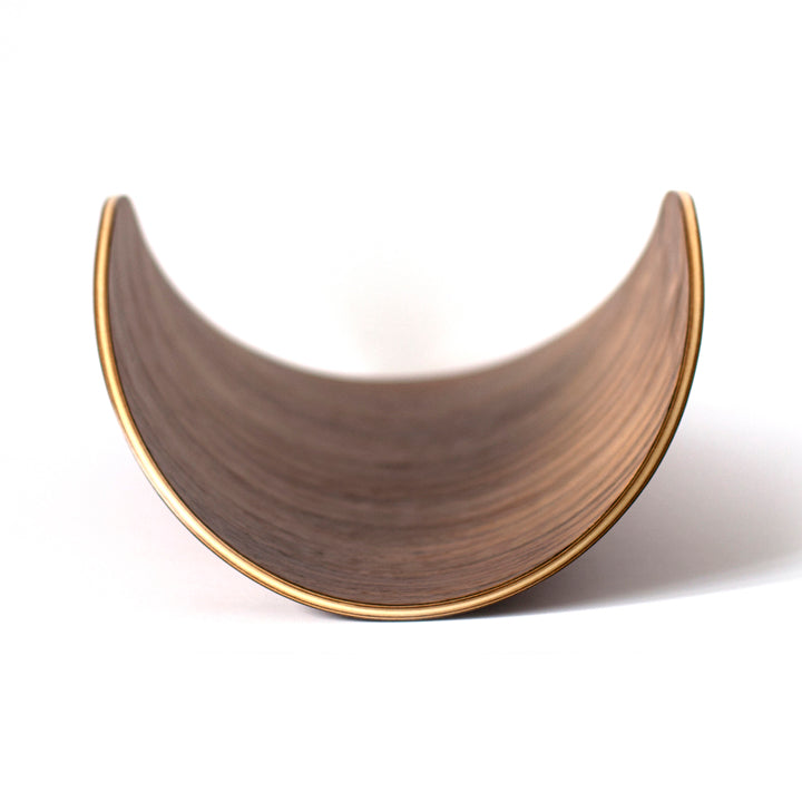
Bent plywood furniture is beautiful (if we must say so ourselves), and with just a little effort your cherished, hand-crafted piece can stay gorgeous for generations to come. Here are a few tips for maintaining your bent ply treasures:
1. Any dust or even light spills can be wiped away with a soft cloth like microfiber or a slightly damp soft rag.
2. Protect the wood surface from hard objects such as glasses or plates (or vintage cameras) which might cause scratches in the veneer. Coasters, cork pads, napkins and tablecloths work well.

3. We use a highly durable finish, but nicks, scratches, and even dents are a part of life. We know it sucks to have that perfect surface marred by an imperfection, but try to see it as a life well-lived. Character comes from the imperfections in life and in furniture!

4. Avoid Moisture - especially on the ends where the layers are exposed. The most frequent cause of de-lamitation of plywood is when it’s allowed to sit in water long enough for the water to seep into the layers. Once water is inside the layers it’s only a matter of time before natural contraction and expansion starts to break them apart.

And it's that easy! With just a little effort, you can keep your bent ply piece looking great for years to come.
How to Get the Most Out of Your Ray Tablet Stand
With all of the information and entertainment it provides, the iPad (and it's non-Apple counterparts) is just about a constant in our lives. Here at Ciseal, we find ourselves using our tablets all over the house and office, and the Ray tablet stand is always a close companion. We even find ourselves using the Ray with iPhones, books, and even art. So, how can you get the most out of your Ray tablet stand? Let us count the ways:
1. Trying new recipes at home is the best, and all of the cooking apps out there make it so easy to find a mouth watering new one and cook away. The Ray makes it so easy to keep that recipe close at hand while you create deliciousness in the kitchen.

2. We all have those recipes in cookbooks that we keep coming back to and cooking again and again. Thankfully, the Ray perfectly holds old fashioned books too.

3. Speaking of books, why not display a cherished childhood story that you constantly revisit? Or, display a photo or piece of art that you love. We love setting up a photo album on an iPad to cycle through precious photos when the family gets together.

4. The Ray is a multi-tasker at bedtime - use it as a double charging station for both your iPad and iPhone. Better yet, the Ray is designed to amplify sound from those teeny tiny speakers so you can be immersed in your favorite soothing bedtime tunes.

5. We're all multi-taskers to a certain extent - how can you not be with your web browser, notes, apps, docs, sheets, photos, etc. The Ray perfectly holds your iPad as a second display for your computer, so you don't ever have to minimize a thing.

6. Don't have your computer with you? Use your Ray to pull up your favorite inspiration photos to get the ideas flowing.

7. Many days, the best part is when you can put everything aside and just relax. We love to sit back and let our minds wander inside a movie, and all we need is an iPad, a Ray, and some popcorn!

Why is Mid Century Modern Still a Thing?
Photo Thrive Furniture
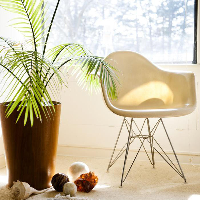
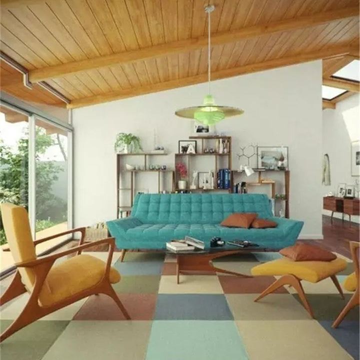
Today, the midcentury look is just about everywhere - and I’d bet that most of the time you don’t even notice it. The recent TV show Mad Men is a bit more obvious of an example, but just about any living space on TV or in the movies from college dorm rooms to suburban living rooms and penthouse apartments will have a Womb Chair by Saarinen or a classic fiberglass Eames rocker (don’t even get me started on how college students can afford these treasures #jealous). Commercials use fun, multi-colored Eames molded side chairs to lend the ease of clean lines and a sense of familiarity to their spots. Flip through design magazines or scroll through interior design photos on Pinterest and hints of midcentury are everywhere. Retailers like West Elm and Thrive Furniture are playing with midcentury looks too - opening the design style to a whole new generation of consumers.
So, what does “Mid Century Modern” actually mean? The simple definition is furniture, architecture, and graphic design created from 1933 to 1965. The phrase “midcentury modern” was coined in 1984 by Cara Greenberg in her book, Midcentury Modern: Furniture of the 1950s. The style’s design elements include clean lines, geometric designs, natural curves, wood, metal, and bright colors.

Photo: Casa Abril
So, why is midcentury still so popular and familiar? After all, it’s been over 60 years since the era was in full swing. In short, midcentury pieces are clean-lined, well-designed, and have a timeless look, so they can easily be peppered into lots of spaces. They still feel modern today. With the trend toward urban living we can only expect midcentury to stay around. The designs are perfect for smaller spaces, are generally lightweight for those who move frequently, and lend a sense of familiarity to every space they’re in.


