The Ciseal Blog

Get Outside in Detroit: 5 of the best Metro Detroit parks and trails to get you into nature
Detroit is a big city - maybe not so much population-wise anymore, but in terms of area, Detroit is huge! Most are surprised to learn that the entire cities of Boston and San Francisco as well as the borough of Manhattan can comfortably fit within the land area of the City of Detroit. That’s not including the sprawling suburbs which stretch the concrete landscape tens of miles outside of the city limits. The car culture is certainly strong in the Motor City, and sprawl is just one way that’s manifested in Southeastern Michigan. But where can the nature lover go when the endless miles of city and suburb get to be too much? Here are some of the best parks and trails in the Detroit area for when your need for nature beckons.
Belle Isle

Photo: Indianvillage-wnfga.org
Starting in the heart of the city, Belle Isle is one of Detroit’s oldest parks. The island in the middle of the Detroit River and abounds in natural wonders. You can go for a swim, rent a kayak, check out the beautiful aquarium, oggle at the vintage yachts at one of the nation’s oldest yacht clubs, take a peek in the Conservatory, explore the wooded areas and trails, or watch the sunset over the skyline of Detroit. There are so many things to do on Belle Isle. It’s truly an oasis in the city.
The Riverwalk & Dequindre Cut

Photo: Detroitgp.com
Over the past few years, the city has revitalized the riverfront and turned it into a beautiful promenade that connects multiple parks along the Detroit River. The Riverwalk currently stretches for almost five miles along the Detroit River, and soon a new stretch will open to create a continuous path all the way to the MacArthur Bridge to Belle Isle. Starting at Atwater Street, the Dequindre Cut is a rail trail that heads Northeast from the Riverwalk and stretches 2.5 miles to Eastern Market. The graffiti on the overpasses along the trail is definitely worth renting a bike or lacing up the shoes for a short run. Plus, at either end you have delicious food and drink at Eastern Market or Atwater Brewery - you can’t go wrong.
Lakeshore Drive

Photo: Mapio.net
Just outside of Detroit, Lakeshore Drive offers spectacular views of both million dollar mansions and Lake St. Clair. Going for a bike ride or run along the shore is a must for any architecture fan. The route stretches about three and a half miles from the Grosse Pointe Yacht Club and ends at the War Memorial. Along the way, Albert Kahn-designed mansions will make you drool, and constant lake views on the other side will bring you back to reality. It’s fun to venture into the neighborhoods, too, and see some great examples of Colonial and Tudor Revival and even some International Style homes.
River Rouge Park

Photo: Detroit1701.org
I’d be remiss to not include Rouge River Park on the list because of the impressive revitalization effort of the Friends of Rouge Park. It’s located about 14 miles outside of downtown (I mentioned how large Detroit is, right?) near the absolutely gorgeous Rosedale Park neighborhood (which is worth a visit as well). It is much more natural than the previous parks with secluded, natural trails along the river that feel like you’re in the wilderness rather than inside the limits of a major city. The park and trails are really well maintained and kept super clean thanks to the Friends of the Park. There are also monthly events in the park like fun runs and 5Ks if you’re a runner.
Paint Creek Trail

Photo: Paintcreektrail.org
Metro Detroit has 13 beautiful Metroparks which dot the suburban landscape and ensure you’re never too far from nature. In addition to the Metroparks, there are numerous Rail Trails, and one of the best is the Paint Creek Trail. The Paint Creek Trail runs from Rochester about nine miles to Lake Orion. It’s a well-maintained limestone path with pretty views of the creek and surrounding wooded areas. Plus, there’s a year round Cider Mill at about the halfway point if you need to replenish your carbs. The Rochester Riverwalk, the Clinton River Trail, and the Macomb Orchard Trail intersect it, leading to even more ways to get away from it all. It’s a bit outside of the Downtown area (about 25 miles North), but it’s one of the best maintained and easily accessible trails in the area.
There are many, many more parks and trails in Metro Detroit, so you’re never too far from being immersed in nature. I’d encourage you to step outside of the concrete jungle every once in a while and find your favorite park to get away from it all.

Lessons From STEM to STEAM: Why STEAM is the Path to an Awesome Future
I wrote previously (My Journey From STEM to STEAM) about my past in engineering and how learning Industrial Design has changed my perspective on product development for the better. I talked about how important it is to include Art and Design in our increasingly technology-focused education system. Having both parts of the product development process under my belt now, here are three lessons I’ve learned for why STEAM is the path to a more wholistic future:
Find the right questions in order to fully understand the task at hand.

The difference between my engineering education and design education was in how success was achieved: Success in engineering school depended on memorization and repetition of “what to know” and “what to think." Success in design school depended on critical thinking and creative interpretation to discover “how to know” and “how to think.” That ability to think critically and creatively interpret situations is the key to our new technology-driven economy. Critical thinking is how we discover the root problem that needs solving. Creative interpretation allows us to see new ways of using our knowledge of how things are to imagine new possibilities for how things could be.
Develop a solution that appeals to our emotions.


McMansion Photo: McMansionHell.com
What happens when you strip all form from your values and just focus on function? We’ve all seen the bland, soul-sucking Soviet apartment developments of the Cold War. Nobody deserves a life so void of beauty. On the other hand, what happens when you strip all function and durability from your values and focus exclusively on form? I give you McMansions - ginormous homes built in the US during the real estate boom which consist of questionable material quality and all of the “house” design elements ever imagined literally stuck onto the front of the building. There is obviously a need for both imagination and prudence to create appealing, functional, and progressive products, which leads into the third lesson.
Collaborate to bring to life beautiful and durable solutions that improve our lives.

This is where both the engineers and the artists need to get their hands dirty. Together. STEM is certainly valuable, but when we place too much importance on these fields, it creates a rift between the “implementers” (STEM people) and the “designers” (Art people). I saw this rift first-hand throughout my engineering career. Some engineers will tell you that they don’t have an artistic bone in their body. They don’t understand why designers fuss about shape, color, material, and proportion so much when those things don't serve a real purpose. On the other hand, some designers will claim that they can't possibly understand the complexities of engineering a product. They are happy to drop off a thoroughly impossible design on an engineer’s desk and tell her to make it work. They have no idea what it will take to bring this product to life, and then get angry when engineering changes their design beyond recognition. We would all be better off if more implementers had (or at least appreciated) the creativity, imagination, and empathy that comes from learning to create art. And likewise, if designers approached their work with the practicality, knowledge, and prudence that comes from learning how things work.

Our innate talents and interests are unique to each one of us. It’s a shame that children like me who have artistic talents are being led to believe that they have to leave their eccentricities behind in order to get a “real job” in science or technology. On the flip side, it’s no less shameful for kids interested in science and technology to see their achievements limited because their education only included what’s safe, familiar, and known. Perhaps by adding the “A” (Art) to STEM curriculums, the technology leaders of tomorrow will have a deeper appreciation for finding the right questions, developing emotionally appealing solutions, and collaborating to bring to life products that improve lives. That would truly be an awesome future!
3 Tips for Adding Mid Century Modern Style to Your Home
Welcome back to the final article in our series on Mid Century Modern design. In the first article, we explored how Mid Century design got it’s start and defined some of it’s guiding principles. If you haven’t read it yet, be sure to check it out here: What is Mid Century Modern. In the second article, we shared why we love Mid Century Modern design and some of the reasons why it inspires us every day. Check it out here: Why We Love Mid Century Modern. Today, we’re closing out the series with some practical tips for adding a little Mid Century Modern style to your home.
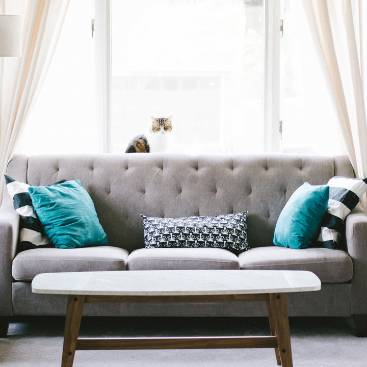
Last week, we learned about three features of mid century design that make us swoon: nature, simplicity, and color. Your home doesn’t even have to be in the Mid Century style for any of these tips to be applicable. Mid Century design has enjoyed it’s long run of popularity precisely because it works so well with other styles. The simple shapes, nod to nature, and bright colors can add functional beauty to any room regardless of if it’s in a victorian, a craftsman or a proper mid century modern abode. Here are some practical ideas for adding some Mid Century style to your home through the use of nature, simplicity, and color. And, no, an Eames lounge chair and Noguchi coffee table are not required.
Nature

Photo: Midwestliving.com
Mid Century architecture often features large windows, but even if your house is more mid century modest with smaller windows, you can still reap the benefits of nature. Make your windows a focal point as much as you can by keeping the drapes and dressings light and streamlined. For the rest of the room, choose furniture and decor that’s made from natural materials like wood, stone, leather, ceramic and natural textiles. Pieces that are inspired by nature, like our Aspen Magazine Rack, are perfect for bringing in a natural touch while keeping it modern. To finish it off, bring some nature indoors with green leafy plants like fiddle leaf figs, cacti, and succulents.
Simplicity

Photo: blog.froy.com
Whether you’re designing the overall feel of a room or looking for one piece of furniture, you can use this concept of simplicity as a guide. For example, a relaxing and inviting seating area in your living room focuses the attention on conversation and connection. For the individual pieces of the room, look for furniture and decor items that have clean lines and that serve a purpose. Our Alden Table is a shining example with it's strong, clean, simple lines and purposeful functionality. Keeping extra elements to a minimum and making sure they all have a purpose brings negative space into the design, opens up the room, and allows each element to shine.

Color

Photo: apartmenttherapy.com
Ciseal's Michigan Left Table Lamp
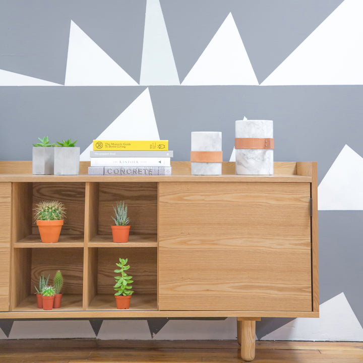
Why We Love Mid Century Modern
Welcome back to the second article in our series on Mid Century Modernism. In the first article, we explored how Mid Century design got it’s start and defined some of it’s guiding principles. If you haven’t read it yet, be sure to check it out here: What is Mid Century Modern. Next week, we'll provide some tips for adding some Mid Century style to your home. Today, we’re going to share why we love Mid Century Modern design with some of the reasons why it inspires us every day.
As we learned last week, Mid Century design has been around for quite a while. Most of the time, styles are cyclical with trends coming and going as the newest shiny object grabs our attention. The strange thing about Mid Century design is that it’s never really gone away. It’s had it’s ebbs and flows, certainly, but since it’s birth in the 1940s we’ve seen Mid Century elements incorporated into our living spaces quite consistently. Why do we love it so much?
Nature: The Foundational Element

Photo: Mosaikdesign.com
Nature’s calming influence permeates Mid Century design to it’s core. Large windows and sliding glass doors connect the indoors with the outdoors making it easy to enjoy nature right from your living room. Just like Mid Century design, simplicity and color are foundational elements in nature, too. Next time you’re in awe of a landscape, step back and appreciate the shapes and colors that bring it all together. Why we love nature: Nature’s clean lines, simple shapes, and bold colors are the perfect inspiration for a cohesive Mid Century room.
Simplicity: Focus on Function

Photo: Caterpillar House
Looking at the clean lines and simple shapes of Mid Century architecture and furniture, you can see that 'less is more’ is a guiding principle. When the ornate embellishments and excess stuff are stripped away, function becomes the focus of attention. Why we love simplicity: In a busy world with so many things constantly trying to get our attention, a simple, functional room with clean, geometric furniture can be an oasis.
Color: Let’s Have Some Fun

Photo: Nestmodern.com
Simple, clean shapes are super functional, yet they do lack interest. I mean, I love me a clean-lined mid century credenza, but a room full of simple geometric shapes leaves me wanting a bit more. This is precisely where color comes in - to add a very necessary layer of interest to the room. In the beginning of the Mid Century era, bright, cheerful colors communicated a fun, optimistic feel which was a welcome change after the Second World War. Why we love color: It’s usually that bright, cheerful, colorful element in a room that instigates a joyful smile.
Mid Century Modern design has been a part of our interior designs for well over half a century and it’s showing little sign of going away anytime soon. The connection to nature, clean lines, and bold colors are now timeless design elements. Be sure to check out the last part of this series: our tips for adding some Mid Century style to your home.

What is Mid Century Modern?
Here at Ciseal, our focus is on making Mid Century inspired furniture, lighting, and home decor for the modern day. In this series of blog articles, we’re going to dive into defining Mid Century design for your home, share why we love Mid Century, and provide some tips for adding some Mid Century style to your home. This week, we’re kicking off the series by exploring a question we get asked quite a bit: What is Midcentury Modern?
When you hear “Midcentury Modern” what do you think? Is it the set of Mad Men? Maybe it’s your parents' or grandparents’ dated furniture and decor. It could conjure up images of bright colors and earthy wood tones. Or tacky wood paneling and a well-past-their-prime shag rugs. Mid Century is such a broad category, and everyone seems to have their own definition and interpretation - which we love!
Most homes that are considered Midcentury Modern were built between the 1940’s and 1970’s, but modern interpretations continue to be built today. The originators of the style were modern architects including Walter Gropius and Marcel Breuer who fled Nazi Germany for the United States before World War II. Other influential designers include Ludwig Mies van der Rohe who was the Architecture department head at the Illinois Institute of Technology, Frank Lloyd Wright students Richard Neutra and Rudolph Schindler, and Cranbrook Academy of Art Alums Charles and Ray Eames and Eero Saarinen.
World War II was important to the style because it necessitated experimental technologies and materials like plywood, steel, and aluminum which went on to be used extensively in buildings and decor after the war. According to Sian Winship, president of the Southern California Chapter of the Society of Architectural Historians, “The birth of midcentury modern was after the war. The houses had open floor plans and giant sliding-glass doors, which encouraged people to go outside and be healthy. In a traditional home, the window height is 4 to 5 feet, and you can’t see out as a child. With these walls of glass, children became engaged and open-minded because the environment stimulated the senses in a different way.”

Photo by Midwestliving.com
The ultimate goal of Midcentury Modern design is to inspire and encourage us to explore the world around us in new ways. At it’s roots, Midcentury Modern architecture utilizes four key elements to blend our interiors with the world around us:
-
Extensive glass: Large windows and sliding-glass doors drape the outside walls of Midcentury homes to allow natural light to flood indoors.
-
Open design concepts: Midcentury Modern homes will have partial walls, small sets of steps between rooms to create split-level spaces, and cabinets of varying heights to create defined areas in otherwise open spaces.
-
Simplicity of form: The flat planes and geometric lines of Midcentury houses create low, sweeping flat or gabled rooflines, repetitive linear patterns in support beams and posts, and brick- or stone-clad chimneys that anchor the design.
-
Connection with nature: Midcentury rooms have a connection to nature through expansive windows or multiple access points to draw the residents outside.
A few famous examples of Midcentury Modern homes include:
Stahl House - Case Study House 22

Photo by Midcenturyhome.com
Eichler Homes (there are a lot of them!)

Photo by MCMdaily.com
Jens Risom's Block Island Home

Photo by Dwell.com
Farnsworth House

Photo by Farnsworthhouse.org
So, that’s your primer on how Midcentury Modern came to be and how it’s defined. Next week we’re going to explore the specific reasons why we here at Ciseal love Midcentury design. You can read that article here: Why We Love Mid Century Modern.
4 Ways To Add Dimension to Your Room with Texture
Photo: Houzz
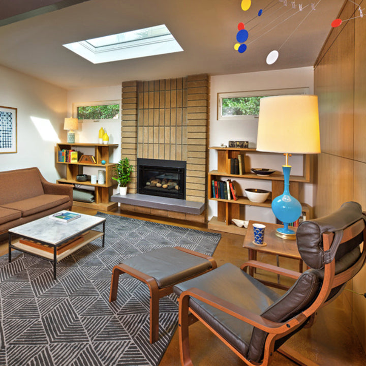
Designing a room is like a balancing act. Line, shape, form, space, color, value, texture: all of these elements work together to create a cohesive design. It’s easy to consider the shape and color of the various pieces you include in a room, but when you throw some texture into the mix you really make the room sing. Here are four ways to bring in some texture and add depth to a space.
Walls

Photo: Houzz
Midcentury houses abound with naturally beautiful brick fireplaces, stone walls, and wood paneling. If you’re lucky enough to live in a home with these textural elements, then draw attention to them with graphic wall art or even bright glass or pottery against your brick fireplace. But what if your home lacks these textural details? Never fear! You can add some texture with wallpaper. Choose one wall to attract attention, but not overwhelm the space. Most wallpaper manufacturers have vivid, textural midcentury inspired patterns that will be the perfect accent.
Floors

Photo: Houzz
Hardwood and tile provide their own natural texture and make open spaces feel even larger. To define different areas of your space for relaxing or dining, look to soft, textural area rugs. Classic midcentury rugs range from white shag to colorful geometric shapes, so you’re sure to find one that fits your style.
Furniture

Photo: Houzz
Textures are easy to mix with furniture. Look to leather, wood, glass, plastic, fiberglass and upholstery to enhance your space with different textures. For example, combine an upholstered couch with a leather and wood lounge chair with a molded fiberglass Eames rocker and a wood and glass coffee table.
Fabrics

Photo: Houzz
Pillows and throw blankets add the finishing touches to a well rounded room. That’s especially true when you have a furniture set that has matching textures. Bright, textural pillows and soft, shaggy throws bring a variety of textures to your space. Plus, they’re easy and inexpensive to change out if your style changes.
Midcentury Inspired Must Haves: Wood Furniture
Natural wood is one of the basic tenants of midcentury modern style. All along the spectrum from blonde birch to dark walnut, the warmth and varying grain of natural wood furniture brings natural beauty indoors to our favorite living spaces. In midcentury spaces with pops of bright color and graphic patterns, the neutral tones of wood furniture help to bring the room together. Here are 5 wood furniture pieces that will bring that midcentury touch of wood to any room in your home.
Fast Freddy Bench by Jory Brigham Design
Whether you need a quick seat at the foot of your bed or a statement for your entryway, a midcentury-inspired bench is just the thing to bring in some wooden warmth.
Soto Concave Lounge Chair by Joybird
It’s easy to make a statement with a wood midcentury lounge chair or two. The wood arms and legs add a natural, sophisticated look to your living room, office, or bedroom.
Coleman Stool by Greta de Parry Design
By blending graphic, angular legs and a warm wood seat, midcentury inspired stools add a distinctive warmth to your kitchen.
Berkeley Bed by Hedge House
Minimal and modern simplicity is all you need for a good night’s sleep. Bells and whistles need not apply.
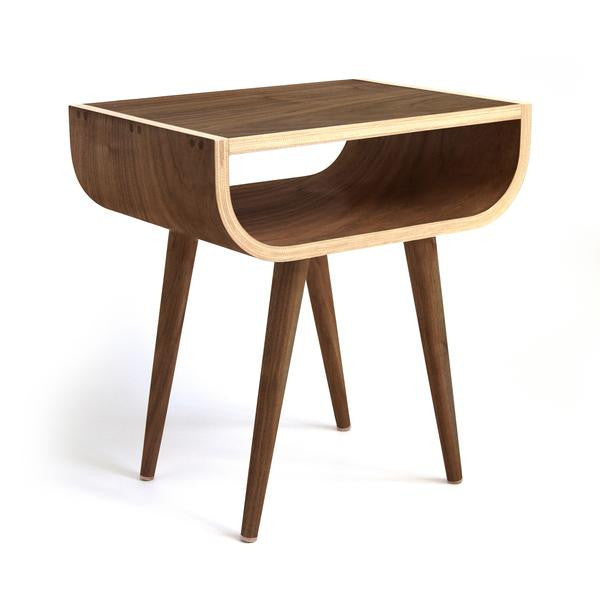
Pontiac Table by Ciseal
Add a versatile side table next to your bed, beside your couch or between a couple of the lounge chairs above. The natural wood tones are sure to add a relaxed feel to any room.
Inspiration Friday: Frank Lloyd Wright's Fallingwater
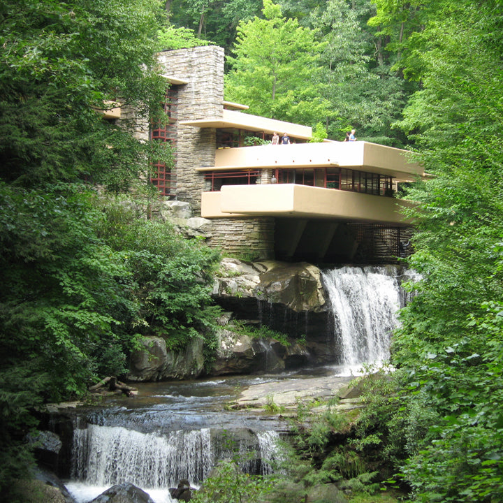
Fallingwater (Roadtrippers).
Frank Lloyd Wright’s distinguished career centers on his most famous structure: Fallingwater. Originally a weekend home he designed in 1935 for Liliane and Edgar J. Kaufmann, it’s sparked wonder for many who dream of what it would be like to live over a waterfall in the remote forest of western Pennsylvania. In exploring the history of the house and Wright himself, I’ve come to appreciate that it represents the rebirth of Wright's career after a long period marked by frustration and unfinished projects. It is a masterful application of Wright’s unique style, and I hope you enjoy the history and thoughtful design of this home as much as I do.
During the two decades preceding Fallingwater, Wright saw his personal and financial lives collapse. His precious Wisconsin home, Taliesin, had two fires, and then he had to give it up due to bankruptcy proceedings and divorce litigation. Between 1925 and 1934 only five of his commissions were built, and he struggled to survive financially. The general public assumed he had retired. He needed a project that would rescue him from the doldrums – both financially and publicly.
For Wright, the problem with modern architecture was how to harness new materials to create a humane environment. Due to Hitler forcing many artists and architects out of Europe and after a 1932 exhibition at the Museum of Modern Art the International style began to take hold in America. Wright, however, disliked its sterility, boxiness and disregard for the individual and site. While working under Louis Henry Sullivan in the late 1800s, Wright learned how to synthesize the sensuous, tactile, emotion-based architecture theories of John Ruskin with the structural rationalism approach of the modernists. For example, the Wainwright skyscraper of 1890 in St. Louis, Missouri is a successful culmination of rational use of modern materials with richly decorated details.

Wainwright Building (Zbaren)
Fallingwater displays Wright’s distinct modern yet organic architectural style in what proves to be his most successful union of building and site. Wright took what he learned from Sullivan, Ruskin and even the International Style architects (although he would not care to admit it) and developed his own organic-modern style. Wright’s homes displayed unifying themes such as,
- The effort to harmonize with their surroundings through low-hipped roofs and horizontal extension,
- The use of natural materials,
- Restraint in the use of ornament, and
- Unification of architecture, nature, and interior design to create a modern home that’s fully integrated in it’s site.
Though Wright referenced his predecessors and contemporaries, his style was more natural and personal than the Internationalists, more innovative in the use of industrial materials and methods than Ruskin, and less decorated than Sullivan.
To describe his unique style, Wright said in his essay “The Natural House” that the proper house should be one that is “Integral to site; integral to environment; integral to the life of the inhabitants.” Houses had to be fitted to the client as well as the land it sits on, and the design should be so in tune with the surrounding landscape that the site would be lacking without it. He called the style “organic architecture.” His style was uniquely his, and all that Wright needed to emerge from the longest drought of his career was a client who shared the same ideals.

The Kaufmann Family: Edgar Jr. (center) with E.J. (left) and Liliane (Post-Gazette)
Liliane and Edgar J. Kaufmann were wealthy Pittsburgh department store owners who were looking for a weekend retreat. They were committed to bringing their Bear Run property back to life from years of overworking by the mining and lumber industries. Mr. Kaufmann cleared away distressed or dead trees and re-forested the property with native trees and plants. He also revitalized the fish and game on property by providing grazing lands and winter feeding areas.
For their weekend home on their beloved property, the Kaufmanns wanted to put the land before architecture. They had no interest in building a huge castle or chalet like the vacation homes of their contemporaries. It was of utmost importance that this home would live in harmony with the land and even enhance the natural elements around it. They hoped to build a country house in which they could renew themselves in nature.
Even though modern architecture was not very popular in the United States in the early 1930s, The Kaufmanns grew to appreciate the modern aesthetic through their many visits to Germany and California where Bauhaus, Modern and International Style architecture had taken hold. With their appreciation for nature and their interest in modern architecture it only seemed natural for them to approach Frank Lloyd Wright and ask him to design their weekend home.
In describing his first impressions of the Kaufmann’s property, Wright commented: “There in a beautiful forest was a solid, high rock ledge rising beside a waterfall and the natural thing seemed to be to cantilever the house from the rock bank over the falling water…Then came (of course) Mr. Kaufmann’s love for the beautiful site. He loved the site where the house was built and liked to listen to the waterfall. So that was a prime motive in the design. I think you can hear the waterfall when you look at the design.” Wright’s prime motivation for the design was to preserve the site and enhance the natural elements around it.
Though the location on the side of a steep hill was challenging, it demanded that Wright be creative with the design so that it not only conformed to the site, but also enhanced its beauty. The house would be anchored to four giant sandstone boulders at the top of the twenty-foot falls. Cantilevering the house over the falls would imitate the layered sandstone ledges that extend from the boulders alongside the stream. Terraces extend to different lengths and in all different directions to reflect the trees surrounding the site. The colors he chose for the finishes were pulled right from the landscape around the house. Wright loved to abstract pieces of the landscape into visual design elements of his architectural creations.

Fallingwater (Laurel Highlands)
The masonry walls of the building core were constructed from sandstone quarried on the site, and they were laid to resemble the cliffs bordering the house. Some stones thicker, some longer, some jutting out a bit further than the others, and with nearly invisible mortar joints, the stone looks as if it was naturally stratified. The creation of this stone core creates a strong base that makes Fallingwater appear as if it is an extension of the waterfall.

Masonry Detail (Wright-House)
From this central stone core, terraces and canopies constructed out of reinforced concrete create clean horizontal planes that contrast with the strong, vertical stone walls. The first floor slab extends eighteen feet over the stream. To Wright, the composition of terraces extending from the stone core is reminiscent of branches extending from a tree trunk. Because the terraces were cantilevered through the use of steel reinforced concrete, the outer walls were not load bearing and could be open to nature through wall-to-wall windows.
The Kaufmanns wanted above all a place to enjoy nature, so it is only natural that the spaces inside Fallingwater bridge the gap between nature and shelter. The entry to Fallingwater is relatively nondescript, but once inside the visitors are drawn through the uninterrupted interior to the expansive windows and eventually back outside. True to his organic architecture style, Wright believed that buildings should provide a special kind of shelter: “I began to see a building primarily not as a cave but a broad shelter in the open, related to the vista without and the vista within.” The interior of a house should feel safe and protected, but in no way cut off from the natural world around it. The massive stone walls at the north side of the house provide the sense of protection that Wright desires. In contrast, the wall of windows on the opposite side opens up views of the vista over the waterfall, and allow for abundant light to shine through year-round.

Interior (Fallingwater)
The windows themselves create a linear contrast to the natural, irregular stone walls and the natural world outside. To further enhance the view, the windows are framed in a color Wright called Cherokee Red. He used this color extensively in his organic architecture because it is a deep, natural red color that is reminiscent of fall foliage or iron’s natural patina. The metal serves as picture frames for the ever-changing views of the outdoors.
The living area bridges nature and shelter in other ways as well. In the living room, a clear skylight frames the sky over a dramatic staircase that plunges directly to the water below, bringing the outside inside: water and sky unite. The bathroom off the main bedroom features a sink that is set in an alcove of windows like a window box. Even invisible corner joints serve to make the view to the outdoors seemingly seamless.

Skylight from living room (Solitary Dog Sculptor).

Stairs from exterior (Allyson Scott).
Wright designed the house so that the boulders that the house is anchored to will peek through the waxed flagstone floor – again abstracting the natural world. With the boulders peeking through the shiny, water-like floor, it is as if the interior is sitting in the stream outside. The focal point of the living room is the boulder-framed fireplace upon which the entire house is centered. The kitchen includes another boulder in the floor that creeps inside, providing a place to set pots as the inside and outside become entwined with only a pane of glass in between. Even hallways are treated to the outdoors with man-made stone walls giving way to natural boulders.

Fireplace detail (Artsology).
The furnishings inside Fallingwater are mostly custom designed by Wright to reiterate the linear, cantilevered forms of the exterior. Within the living room, Wright defines areas for dining, listening to music, reading, and writing by varying the ceiling level, quality of light with direct or recessed lighting, furnishings, and wall sections. The black walnut veneered furniture also counters the straight, horizontal lines with some curved edges and soft, upholstered accents. The natural tones of the upholstery fabric enhance the simple palette of the outdoors. As a whole, the interior design reflects and enhances the landscape seen all around it.

Furnishing detail (Sandstead).
I hope you enjoyed learning some of the history of Fallingwater, what led to it’s design, and how thoughtfully it was executed. It is the ultimate display of Wright's organic architecture style with its unification of modernism and landscape, but it may have never happened if not for the Kaufmann family and their appreciation for both modern design and preserving nature. This home is unique in architecture in that it displays both Wright’s creative genius and the natural landscape surrounding it. If you ever find yourself in western Pennsylvania, I highly recommend stopping by for a tour.
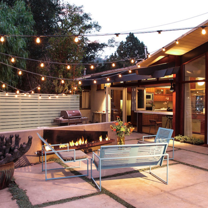
Four Mid Mod Patio Essentials for Summer
We’re finally getting some warmer weather here in Michigan, and it’s about time! With our first heat wave in full swing, my thoughts naturally turn to lazy summer afternoons spent lounging on the deck: A book in one hand and a frosty beverage in the other, the dogs are sunning themselves and quietly watching the ducks swim on the lake. Not a care in the world, right? Well, before the deck or patio can be enjoyed to it’s full potential it’ll probably need some sprucing up. Lets grab some sangria and look at four ideas to create the perfect mid mod patio for summer relaxing.
Soak Up the Sun
Summer can seem like a distant memory when it’s 8 degrees outside in January, so a spot for chilling in the sun is essential. To create your sun worshiping space, find a comfy lounge chair and pick a spot that gets plenty of sun. A location that has a nice view of your perfectly manicured garden is ideal, but for those of us without a green thumb, add a small table to hold a couple of magazines and a margarita.
Comfort and Conversation
Deck parties are the best part of summer, but it’s kinda awkward if everyone’s standing around with nowhere to sit, right? Find yourself a comfy outdoor sofa or chaise to anchor your conversation area and round out the seating with some colorful MidCentury patio chairs. Add an outdoor coffee table in the middle to collect your drinks and proceed with the party!
The Perfect Entertaining Table
The nights are looooong in the summer, and deck parties require barbecue, so get yourself a decent outdoor dining table. Your friends will thank you when they don’t have to eat their delicious potato salad on the same level as your dog. For a dining table that will go the distance until the sun sets and beyond, go for something lightweight so it’s easy to move around the patio. And remember it’s living outside and will get skuzzy, so maybe find one that’s easy to hose off.
Hearty Summer-Loving Plants
If you’re someone who can manage to keep flowers alive throughout the summer, I salute you. For the rest of us, succulents are a perfect way to bring some life to your patio. They’re perfectly Mid Mod too with their bright colors and angular shapes. Mix a few varieties together in a bigger pot or two or space some smaller pots around your deck to add some texture and interest. And you don’t need to worry about watering them (well, on occasion, but they’ll be fine if you forget, I promise).
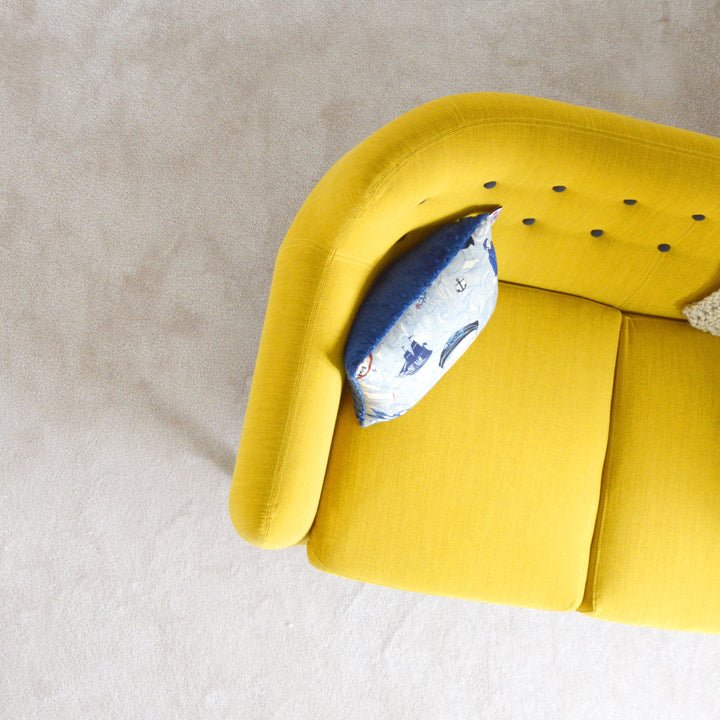
7 Mid Century Inspired American Made Furniture Pieces We're Loving Right Now
Here at Ciseal, we’re always on the lookout for new takes on Midcentury style. It’s amazing to see well-cared-for vintage Mid Century pieces set the tone for a room. And what we really love about Midcentury is how it’s still inspiring designers to create new works today. When those vintage pieces coexist with modern pieces it creates a super interesting mix that pays homage to the past yet feels current. Here are some of our favorite Mid Century inspired furniture pieces designed and made by independent American craftspeople today.
Boulevard Table by Hunt & Noyer
The first thing that stands out about the Boulevard Table is it’s craftsmanship. This table is built to last from specifically selected quality materials and tried and true craftsmanship. It’s safe to say that this beauty will last a lifetime or more! The Midcentury inspired angular base creates a lightness to the design so the table doesn’t take up too much visual weight. Check out the Boulevard Table and Hunt & Noyer’s other pieces in their shop.
Riff Raff Kitchen Island by Wake the Tree
Need a special something to brighten up your kitchen? The Riff Raff Kitchen Island is your answer. The bright powder coated pegboard and gorgeous black walnut island provides some cheery extra storage for your cookbooks, spoons, spatulas, colanders - all of the riff raff that kitchen’s accumulate. It’s also a super functional option as a sideboard or buffet. Check out the Riff Raff Kitchen Island and Wake the Tree's other pieces in their shop.
Roxy Arm Chair by One Forty Three
You had us at bent plywood. The minimal yet comfortable Roxy Arm Chair is the perfect addition to any Midcentury inspired room. The molded plywood seat is just like a warm hug, and that bright Pendleton fabric just looks hot when paired with the warm wood veneer. Check out the Roxy Arm Chair and One Forty Three's other pieces in their shop.
Black Diamond Table by Alex Drew & No One
The geometric lines of the Black Diamond coffee table draw us in like no other. The ebonized black walnut sets a graphic tone for this table that is mesmerizing from any angle. Plus, when you combine four of them together, they create even more interesting shapes and angles where they connect. Check out the Black Diamond Table and Alex Drew & No One’s other pieces in their shop.
Mag Table by Ali Sandifer
Classic Midcentury lines and impeccable craftsmanship is the name of the game with the Mag Table. If Don Draper was designing your living room he would insist on this coffee table. The functional magazine storage keeps the table top clean and tidy because you’ll want to admire that lovely wood grain. Check out the Mag Table and Ali Sandifer’s other pieces in their shop.
Soren Chair by Coil & Drift
The Soren Chair’s minimal aesthetic and it’s naturally beautiful materials pay the perfect homage to it’s Midcentury inspiration. This is a bold statement in a relatively clean-lined chair. The wood and leather play off of each other to provide a graphic, geometric look that we love. Check out the Soren Chair and Coil & Drift’s other pieces in their shop.
Pontiac Table by Ciseal
We’d be a little remiss to not include one of our babies on this list. The Pontiac Table is the newest addition to our collection, and we’re quite smitten. It sports classic Mid Century lines with a bent plywood twist that’s sure to be right at home beside the bed or next to the couch. Check out the Pontiac Table and our other pieces in our shop.
And there you have it! These are just a few of the independently handcrafted American made furniture pieces that we’re drooling over at the moment. Which ones do you want to add to your Mid Century inspired home?
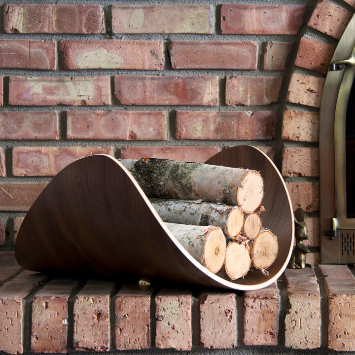
For the Love of Wood
We certainly love our wood here at Ciseal. It’s a material that brings natural warmth and beauty to our designs. We love the variety of woods we get to use too. Each species imparts it’s own unique look and feel that we just can’t get enough of. The woods we use most often and certainly can’t get enough of are Birch, Oak, and Walnut. Find out why these are our favorite woods to work with:
Birch: Elegant Strength
If you’re looking for a neutral backdrop, birch is the way to go. It’s muted tones are perfect for building off of with either color or darker neutrals. Birch is a classic choice for bent lamination because of it’s combined flexibility and strength, which produces lightweight, thin, and extremely strong products. Discover birch in our Michigan Left Lamp, Interlochen Stool or Pontiac Side Table - all prime examples of the refinement of birch.
Oak: King of the Forest
For it’s beautiful grain and unmatched durability, oak keeps us coming back for more. It’s a timeless material that always seems to be in style, and it’s hardness ensures it will last a lifetime. See oak in all it’s glory on our Aspen Magazine Rack, Tahquamenon Stool, or Alden Side Table. Each one will keep you mesmerized at the gorgeous grain of oak.
Walnut: Timeless Warmth
Walnut may be woodworkers' most favorite of all the species to work with. Not only is it a dream to shape, but it’s deep, rich brown color interspersed with an occasional blond streak keeps us coming back for more. Let this alluring wood draw you in on our Ray Tablet Stand, Mission Firewood Holder, or Traverse Table Lamp. Walnut’s depth and warmth are calling you.
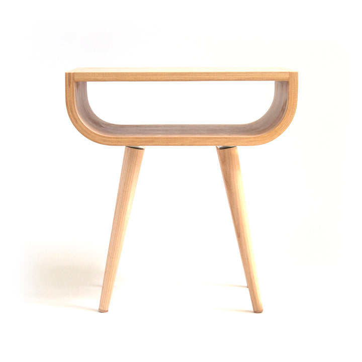
Introducing the Pontiac Table
We're so excited to welcome the Pontiac Table to our collection! We've been designing and prototyping and working out the kinks for months, and it's finally ready for it's big reveal. This brand new design has captured our hearts with it’s timeless lines, and we’re sure it’s going to be a favorite for years to come.

Photo: Metromode
The Pontiac Table is named after the city of Pontiac, Michigan. This city just north of Detroit started as a mill town and then found itself at the center of automotive manufacturing. Now it’s reinventing itself once again with an emerging art, food and craft beer scene to complement new small businesses that are moving into the beautiful downtown area. From it’s downtown with it's big city feel to the parks, trails, and lakes on it’s outskirts, Pontiac has a lot to love.
It seemed fitting to name our new table after this versatile city. The Pontiac Table is based off of tried and true mid century design elements, and we reinvented the classic look with a bent plywood flair. The top is hand layered and pressed to shape in-house. From there, the pieces are carefully trimmed and then joined together with impeccable craftsmanship. And we couldn’t go wrong with the hand-turned, solid wood, classic mid century tapered legs. The Pontiac Table fits right at home beside the bed, next to the couch, or between a couple of lounge chairs. Learn more about the Pontiac Table in our shop and be sure to get one of your own!


