The Ciseal Blog
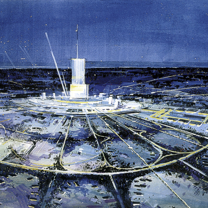
Inspiration Friday: Walt Disney's Original E.P.C.O.T.
The big thinkers of the Mid Century era continue to inspire me in my perspectives on life and work, and one of my biggest inspirations is Walt Disney. I previously wrote about my fascination with Disney concept artist Herbert Ryman on this blog. My favorite of Ryman’s work is his concept drawings for Walt Disney’s original E.P.C.O.T. (Experimental Prototype Community of Tomorrow) project. You’re perhaps familiar with Walt Disney World’s Epcot theme park, but what many don’t realize is that Epcot started off as a much bigger idea.
Although what we see on Disney’s Florida property today is a collection of theme parks based off of Disneyland in California, Walt Disney’s original intention was much more than adding some East Coast theme parks to his portfolio. He wanted to shift the paradigm of urban planning. Disney’s original EPCOT plan was to create a new Utopian City of Tomorrow. In The Florida Film, a 24-minute blueprint for his Florida project, Disney said: “By far the most important part of our Florida Project — in fact, the heart of everything we’ll be doing in Disney World — will be our experimental prototype community of tomorrow. We call it EPCOT.”

(Photo: theoriginalepcot.com)
About his motivation for creating E.P.C.O.T. Walt explained, “I don’t believe there is a challenge anywhere in the world that’s more important to people everywhere than finding solutions to the problems of our cities.” Veteran Disney animator and executive John Hench explained, “Solving the problems of the city obsessed him. When Walt went to New York, he complained about the noise of garbage cans waking him up in the middle of the night. He thought if you could set an example, people would make changes in their own home town.”
Even in the early 1960s, Walt Disney saw that America’s cities were in need of an upgrade. Since most Americans in the 1960s were desperately enamored with the automobile, urban planners prioritized projects that would ease the increasing traffic. Bridges and highways came first with people and neighborhoods relegated to whatever was left of the budget and landscape. Seeing the cultural and environmental cost associated with more and more concrete, Disney created what has proved to be a forward-thinking strategy that we’re just starting to implement today.

Rendering of E.P.C.O.T./“Progress City” 1965 (Photo: Progress City USA)
Disney’s original Experimental Prototype Community of Tomorrow (E.P.C.O.T.) was to be a community of the future that would be a proving ground of new ideas for urban living. Walt Disney described it like this: “E.P.C.O.T. will take its cue from the new ideas and new technologies that are emerging from the forefront of American industry. It will be a community of tomorrow that will never be completed. It will always be showcasing and testing and demonstrating new materials and systems.” Walt and his Imagineers had learned a great deal about environmental and building architecture in relation to crowds while developing Disneyland, and he wanted to see how those lessons could be applied to cities.

EPCOT Radial Design 1966 (Photo: theoriginalepcot)
The plan for E.P.C.O.T. was to build a brand new community concept from the ground up. Taking inspiration to Disney’s clean, controlled environment and layout of Disneyland Park in California, it would be designed in a circular shape with a central hub. The central hub would be the foundation of the community with business and commercial activities centrally located with easy access via a modern transportation hub. The main mode of transportation would be Monorails and PeopleMovers, and all automobile traffic would be underground to keep pedestrians safe above ground. The rest of the community would fan out from the hub like spokes on a wheel. Community buildings, parks, and schools would fill in the area around the hub. On the perimeter of the community, suburb-like residential neighborhoods would provide bucolic housing for the 20,000 or so residents.

E.P.C.O.T.’s Transportation Lobby (Photo: Progress City USA)

The Greenbelt, 1966 (Photo: theoriginalepcot)
Sadly, Walt Disney passed away before the Magic Kingdom opened and his vision of E.P.C.O.T was not able to be brought into reality without his continued cultivation. Some of E.P.C.O.T.’s ideas came to fruition in the theme park that bears it’s name. Epcot's Future World is filled with futuristic thrill rides which encourage guests to stretch their preconceived notions about transportation, design, science, and the world around us. The theme park's World Showcase is a slightly altered version of the original E.P.C.O.T. International Shopping District where you can sample food and drink from around the world. Walt Disney World itself is a testament to Disney’s crowd management and mass transportation ideas with it’s ability to welcome hundreds of thousands of visitors each day and efficiently provide transportation, housing and food.

Concept for the “Spanish District” of EPCOT’s International Shopping Center (Photo: Progress City USA)
Disney’s hope was that if the E.P.C.O.T. prototype was successful, it could be replicated in other areas around the country. Even today, the E.P.C.O.T. concepts are inspiring urban planners and developers who want to make living within a city more efficient and enjoyable. In Detroit, for instance - a city that’s been very rooted in the automobile culture for decades - we’ve seen an increase in people moving into more urban areas where developers have begun to create little cities within the city. These little cities create a compact combination residential space, office buildings, hotels, shopping and entertainment districts in one walkable area. The addition of Detroit's first light rail line is another E.P.C.O.T. concept that promises to ease the traffic getting to and from the city and the outlying suburbs. So, in many ways, Walt Disney’s vision is being realized still today.

International Shopping Center, 1966 (Photo: theoriginalepcot)
While the development of the full EPCOT project never came to be, the overarching ideals still ring true today - perhaps more than ever. The concerns about automobile traffic, land management, and city planning that Walt addressed in the 1960s are still things we’re working to improve on and find solutions for. It’s exciting to me to see Walt Disney’s ideas being implemented in my hometown to make city life a bit easier and enjoyable today - 50 years after his passing.
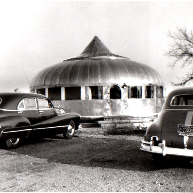
Inspiration Friday: Buckminster Fuller's Dymaxion House
Being both a mechanical engineer and industrial designer, I am always on the lookout for products that push the theoretical boundaries of technology and challenge the status quo. Some designs might not be massively popular or even go into production, but they serve as inspiration for how to apply new technology in innovative, sometimes unintended ways. These objects change the way other designers look at the world. Buckminster Fuller’s Dymaxion House at The Henry Ford demonstrates a new way of designing a shelter, and while it was never produced on a mass scale it challenged the way other designers and architects viewed technology, manufacturing, and design.

Buckminster Fuller, Photo: PBS
R. Buckminster Fuller was a philosopher, inventor, and designer born in Milton, Massachusetts on July 12, 1895. “Bucky” Fuller, as he was commonly known, wanted to make the world work better for all of humanity. He is best known as the inventor of the geodesic dome, of which over 300,000 have been constructed worldwide. Throughout his career, he stressed responsible conservation of the earth’s resources, and emphasized technological efficiency by creating objects that do more with less. His impact on the world is found in his continued influence upon generations of designers, architects, scientists and artists working to create a more sustainable planet.

The Biosphere Environment Museum, Montreal, Quebec, Canada, Photo: Architectural Digest
Bucky started thinking about the Dymaxion House concept in 1927. At the time, the aircraft industry was developing new technologies that created strong, lightweight structures and materials. In this same era, traditional buildings depended on compression on their walls to support the roof. Bucky found this paradox absurd. He knew that modern technology had developed tensile materials which are many times stronger in relation to their weight than compression materials. If Bucky could develop a house that was designed to use a tension structure he could reduce weight, use fewer materials, and therefore reduce the cost. In the end, Bucky saw this design as a mass-produced house that could potentially solve the world’s shelter problems.

Dymaxion House Drawing, Photo: Archdaily.com
After World War II, Fuller decided that the time was right to produce the Dymaxion House. He convinced Beech Aircraft of Wichita, Kansas to work with him since the materials used in the house were very similar to those used in aircraft and after the war the aircraft factory would have extra capacity. In 1945 he introduced the Wichita House, which was an updated version of the Dymaxion House. Bucky had a hard time compromising on his design, and the house never made it to full production. Only two prototypes of the house were ever produced.

Dymaxion House Construction, Photo: HPEF
The Dymaxion House carried Corbusier’s “machine-for-living” concept to the next level. The house was designed to be mass-produced, affordable, easily built on site, air-delivered and environmentally efficient. The living space was suspended using tensile materials from a central mast. This reduced the home’s footprint to a pillar in the ground, and the area under the living space could be landscaped. Structure similar to the spokes of a bicycle wheel hung down from the mast to suspend the domed roof, and beams radiated out to support the floor. Since they were not load-bearing, the outer walls were made of glass with sliding panels to allow for continuous, natural air-conditioning through the central mast. The house was designed to be easily movable and independent of its location so if the homeowner decided to move, the entire thing could be picked up and re-planted anywhere.

Dymaxion House Exterior, Photo: TournaTalk
Fuller made many design decisions for the house that affected both its form and function. At 1,017 square feet, and with two bedrooms the Dymaxion House was designed for single families of no more than four people. In addition to the bedrooms, the house features a foyer, living room, dining room, kitchen, kitchen storage, a Dymaxion modular bathroom, stainless steel fireplace, O-Volving shelves, and revolving shoe and clothes racks. It was supposed to cost about $6,500 in 1946 which was about the cost of a luxury automobile.

Dymaxion House Interior, Photo: Dead Inventors Appreciation Society
The exterior of the house was made out of aluminum because Bucky wanted to use this relatively new material for its strength and low weight. It was ideal for a mass-produced, transportable, easily disassembled house that could withstand strong storms such as tornados. Aluminum was also already familiar to aircraft manufacturers whom Bucky saw as likely partners in the production of the houses after the war. The round shape of the house reduces the amount of materials needed while maintaining strength.

Dymaxion House at The Henry Ford Museum, Dearborn, Michigan, Photo: The Henry Ford
Critics of the Dymaxion House point out that its design is inflexible and it completely disregards the site upon which it is built. A more customizable design would make it a true home for the masses because each family could choose the elements that are important to them instead of settling on one design for all. In addition, Fuller’s choice of energy-intensive materials like aluminum apparently disregards his desire to create an environmentally sensitive housing solution. However, Fuller chose aluminum for its low weight, strength, and durability – all factors that over the lifetime of the product would compensate for its initial cost.
Buckminster Fuller’s Dymaxion House is an example of how technology and engineering can inform a design and help to create a concept that challenges the status quo. He questioned how houses were traditionally constructed and he applied new technology to help solve problems he saw in their manufacture, structure and assembly. It’s a great example of an object that challenges future designers to continually stretch boundaries.
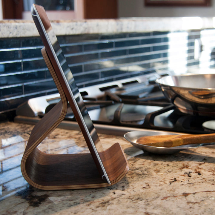
The Story Behind the Ray iPad Stand
I often get asked about how a Ciseal product comes to be - what inspires the designs, what the process involves, how the products are made, etc. Each Ciseal product has a different story behind it and a different inspiration. Some products were created to solve a problem or to fill a need. Others were inspired by a shape or place or thing and I set out to reinterpret that inspiration as a bent plywood object. With such different inspirations, each one of Ciseal's products is unique in and of itself, so the process of making them varies a bit as well. That variation is what’s so magical to me, and it's why I find so much joy in making each one. To kick off this behind the scenes series, lets start with Ciseal’s first product - the Ray iPad Stand.

Photo: Cablik Enterprises
In setting out to design and make the Ray, I gave myself a design brief: Create a Mid Century modern inspired tablet stand. Mid Century was important to me because I love the style's combination of simple, modern lines with natural elements such as wood. Also, I’m a bit obsessed with bent plywood (if you haven’t noticed by now), and Mid Century design is where bent plywood first found it’s form. And it was to be a tablet stand because I wanted to create a product that would be useful as well as beautiful, and the tablet stands I had seen up until then just didn’t cut it from an aesthetic perspective. Sure, they functioned well by holding a tablet upright, but most of them were anything but beautiful.

Photo: Hive Modern
The design process began with a focused sketching session of just getting as many different ideas onto paper as possible. I printed out a few mid century inspired interior photos for inspiration and went to work on a fury of thumbnail sketches with pen and paper. Ultimately, the one tiny sketch I felt most drawn to was one inspired by the Eames LCW chair that was sitting in the corner of one of the living room photos I used for inspiration. That perfectly molded piece that connects the seat to the back had just the right combination of beauty and usefulness that I was looking for in my iPad stand design.
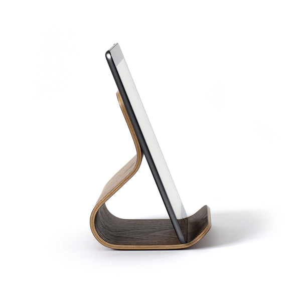
Having chosen a design direction, I had to refine it into a shape that would work perfectly for the purpose of holding an iPad while at the same time retaining the clean, modern shape of it’s inspiration. This is where my engineering side gets to wield it’s numbers and calculations while the design side babysits and advocates for something that’s really, really good looking. The more versatile the design the better, so I wanted it to be able to hold as many different sizes of tablets, books, photos, etc. as possible. I won’t bore you with the details, but the final design you see is the result of many, many sketches, mock ups, and calculations. I played with so many angles and depths and widths to find the perfect viewing angle and the most versatile dimensions.

With the design finalized, it was time to make the real thing! I made a two part mold for this one to ensure there would be even pressure across the entire surface.

Once the glue has dried, I take it out of the mold. The edges are then cut off to even out the layers and trim the stand to size.

And then the edges get sanded and sanded and sanded to polish up the lovely layers. Seriously, sanding takes soooooo much time, but it’s absolutely worth it in the end!

Then we hand wipe the polyurethane finish onto the stand in multiple coats with even more sanding in between each one to create a super durable finish. Then cork feet are added to keep it from sliding around and our stamp of approval is added once everything is perfect.

With the stand complete, it came time to decide on a name for it. Being influenced by Charles & Ray Eames' LCW chair, I thought that naming it after Ray Eames would be more than appropriate. Ray's influence as a woman designer in the Mad Men era is such an inspiration to me, so the name has a double significance. The Ray iPad Stand is available in our three standard woods: Birch, Oak, and Walnut along with a Ray exclusive wood, Sapele. Check them out in our shop and get one for your iPad!

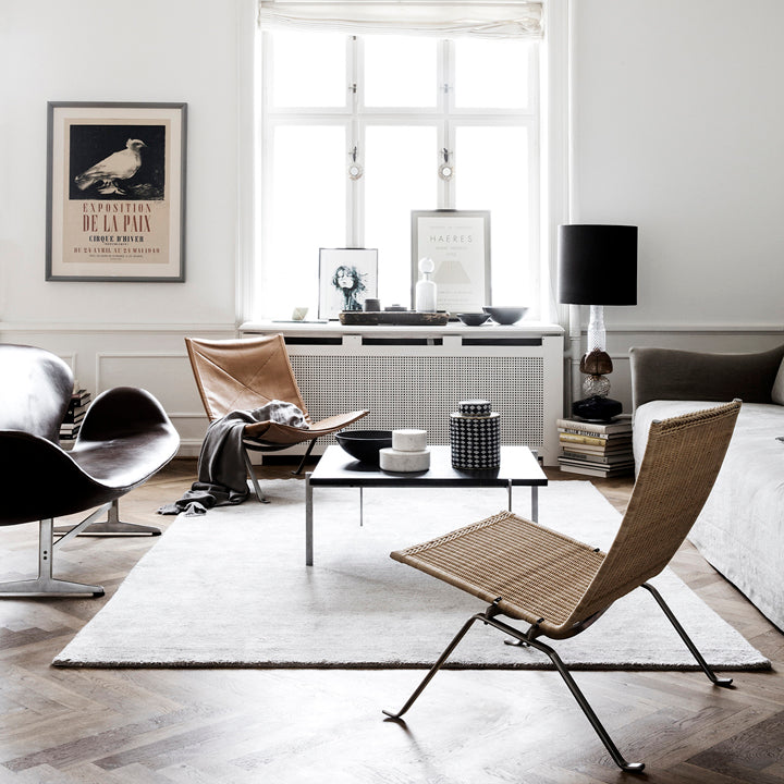
5 Ways to Bring More Color Into Your White Room
(Photo: Line Klein Studio)
White and neutrals are the perfect backdrop for minimalist perfection. Take a look at those clean, modern, Scandinavian inspired homes that feel warm and welcoming in spite of the blustery darkness outside. Done right, white walls fade away, revealing the details of the architecture and the careful curation of the things they encompass. But what can you do when your white walls are feeling simply boring and lifeless? Perhaps you are a color lover who rents and you’re stuck with boring white - or worse, beige - at the moment. How do you make your white walls more clean, modern, warm and welcoming and less, well, sterile? Lets take a look at some white-walled rooms that have that warm and welcome feeling to glean some tips on how to make white walls feel like home.
Natural Wood Tones
Nothing warms a space like wood tones - Nothing! Think of a forest after a fresh layer of snow. The warm, natural wood tones of the tree trunks among all that white are what make the scene so striking. Don’t think the warm tones have to come from just wood either - terra cotta and other pottery can do the trick too. What you’re after is some elements to warm up the color palette and provide some much needed contrast.

(Photo: Sara Medina Lind)
Plants
The combination of green and white is as natural as a forest of evergreens in winter. Plants add both color and texture to a white canvas, and they especially stand out in a white space. Choose a small collection of small, medium, and one or two larger plants to vary the size and height of your indoor garden. Succulents, ferns, clover, and fiddle leaf figs are all great indoor plants that will add a bit of life to your white space.

(Photo: Inside Out Magazine)
Texture
When you want to create a warm and welcoming space, texture is where it’s at. Pillows, rugs, blankets, curtains - pick ones that you just want to run your hands across. They don’t even need to be bright or warm colors either. Muted tones or white on white work equally beautifully when you vary the textures.

(Photo: Inside Out Magazine)
Contrast
Adding some black or dark grays to your white canvas create interest through contrast. That contrast works by pulling your eye to different focal points around the room and as such keeps you interested. The contrast trick works best by drawing your attention to architectural features like fabulous Eichler beams, a fireplace, window frames or even doors.

(Photo: Fog Modern)

(Photo: Inside Out Magazine)
Color
I saved color for last because it’s a touchy subject when discussing all white rooms. Purists can feel free to gloss over this part, but sometimes color can do wonders for an all white room. Some methods for adding color are more unobtrusive than others, so keep these in mind if your landlord’s on the inflexible side: colorful throw pillows, blankets, rugs, bedding, flowers, candles, books, and art are probably the quickest and least invasive way to add some color to your blank canvas. Lets not stop there, though. Changing out your boring lamp and pendant cords with bright fabric ones will create little smiles throughout your day.

(Photo: Fantastic Frank)
A more ambitious way to add color is the accent wall. Now, I know what you’re thinking - Trading Spaces convinced you that accent walls never look as cool as the designer says it will - like, never. I’m in the same boat. Believe me when I say that white walls are my go-to. I’m the first to caution that not every room can pull off the accent wall, but I’m convinced they can provide that necessary warmth and interest to a room that’s begging for a little more. My favorite accent wall ever is what Fog Modern did in their living room. Their lovely Eichler had gorgeous details and furnishings, but all of the white on the walls and floors left the room feeling a little lost. The shade of green they chose is just the right amount of color - not too bright, nut not too muted either. It really pulls together the whole room. I cannot believe I’m saying that I actually like an accent wall, but this one works!


(Photos: Fog Modern)
So there you have it! White walls don't have to be sterile. You can warm them up with natural wood tones, introduce some plants for that natural element, play with different textures, add some contrast, or break the mold with a pop of color. Take it slow by adding a small succulent here and there or go all the way with an accent wall. The possibilities are endless!

Atomic Ranch's Modern Makers: The Handmade Layers of Ciseal's Nicole Hodsdon
Thank you to Jolene of Atomic Ranch Magazine for including me in their Modern Makers blog series! Jolene crafted a very cool story, and I'm honored to be among the women they're profiling for Women's History Month. If you're curious about what inspires me or what goes into the products I make be sure to check it out.
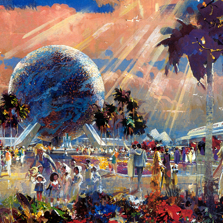
Inspiration Friday: Herbert Ryman's Disney Concept Art
Photo: Micechat.com
I first learned about Herbert D. Ryman (1910-1989) while on vacation in Walt Disney World, and his art has been inspiring me ever since. He was both a commercial and a fine artist who had an insatiable need to sketch the world around him and bring fantastic ideas to life through pen, ink, watercolor, and oil. His work as a Disney concept artist set the tone for every Disney theme park until he died in 1989.

Herbert Ryman at Work (Photo: designingdisney.com)
“My own dream of happiness would be to live in every spot on our globe. To see and study and record and most of all, to understand. And to pass on in some tangible form a fragment of that enthusiasm and love.” –Herbert D. Ryman
His concept paintings were the first blueprint for Disney Imagineers to create their trademark fun-filled parks which transport guests into different worlds in time and space. The story goes that he simply sat d own at his drawing table and drew as Walt Disney described to him his dream for a fresh and clean version of the creepy, run-down amusement parks of the day. The ease in his style, the whimsy of the lines, the tones of the bold colors, and the composition all combine to give the viewer a sense of “what’s next, what’s around the corner?” - just like you feel in the parks themselves.

Photo: Micechat.com
“Be inordinately infatuated with the world—its people, its history, and geography. Let your eyes speak to your heart and your heart to your hand.” –Herbert D. Ryman
Ryman’s extraordinary talent was in his ability to take ideas that resided in the excited mess of the mind and extract their essence into inspiring concept art. His original concept drawing for Disneyland is what earned Disney the financial backing to continue the project and bring it into fruition. Without Ryman's ability to put beautiful ideas on paper, we may never have seen Walt Disney’s true vision for his parks come into reality.

Disneyland Schematic (Photo: disunplugged.com)
Ryman’s concept art continues to be referenced by Disney imagineers, and they use it to inspire updates to the parks even today. Take a look at some more of his artwork below and let it inspire you to create a more beautiful tomorrow.

American Adventure, concept painting, Epcot, 1979 (Photo: disunplugged.com)

Horizons Building Concept (Photo: disneyatwork.com)

The Land Pavilion Concept (Photo: disneyatwork.com)

Central Plaza Concept Art, Tokyo Disneyland (Photo: disneyandmore.blogspot.com)

EPCOT Center Concept (Photo: Insights and Sounds)
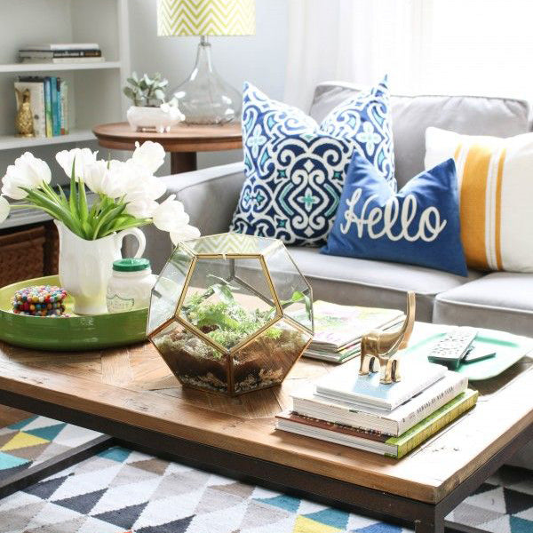
Clear Your Coffee Table Clutter
Photo: Laura Trevey
Coffee tables are like the catch-all of your living room. If it’s anything like mine, there are any number of things that have landed there this week and haven’t managed to leave. Things like old magazines, a small stack of books, empty glasses, about 8 different remote controls, unopened mail, some burned incense and a candle or two with the matchbook probably somewhere nearby, maybe even a dog toy that even the dog won’t admit to leaving there. I have to admit, I’m a bit envious of the OCD among us who manage to perpetually keep their daily living spaces as orderly and pretty as a magazine photo shoot. In my experience, life happens literally around my coffee table and before I know it, there’s a cluttered mess awaiting me when all I want to do is curl up with a puppy snuggle and movie night.
Fortunately, It’s easier than you might think to de-clutter life’s messes when you have the right tools. I’ve found that grouping smaller things together get you on your way to clean, anxiety- and clutter-free design instantaneously.

Photo: Brit+Co
To start, grab a couple of small bowls, trays, or baskets and corral your similar odds and ends in one dedicated spot. Incense, candles, and that matchbook go in one, and all those remotes go in another.
Next, get yourself a magazine holder (like Ciseal’s Aspen Magazine Rack), and stylishly display your to-do list of periodicals.

Photo: Homedit
Finally, add some life to the mix with a succulent or a small vase with some fresh cut flowers.
Need some inspiration? Take a look at these intentionally appointed coffee tables that make decluttering a breeze:


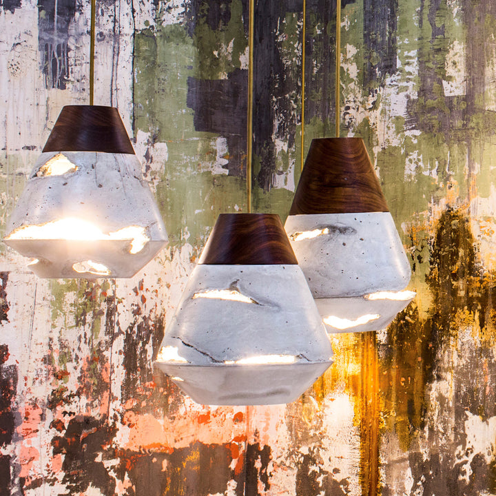
5 American Made Lamps We're Loving Right Now
We’re always on the lookout for American made goods to fill our homes. The right lamp sets the perfect mood of the room it’s in, and all of the options available today make us feel like kids in the candy store. There are so many makers out there creating quality, unique goods that we just had to share our favorites. Here are five lamps we’re drooling over right now:
The Colony Chandelier by Worleys Lighting
The atomic-inspired glass globes bring an understated refinement to this chandelier which would look perfect in a mid century modern entryway. We love the combination of wood, brass, and glass in this piece. Made by hand in Charlotte, North Carolina. Check it out in the Worleys Lighting shop.
Swing Lamp 16” by One Forty Three
We’ve been big fans of One Forty Three for years - be sure to check out their bent ply wares as well! This wall-mounted swing lamp is one of their original designs, and the variety of finishes from metal to bright primary colors to wood mean you can get one that perfectly complements your decor. Made by hand in Henderson, Nevada. Check it out in the One Forty Three shop.
Alberta Table Lamp by Caravan Pacific
Each Caravan Pacific lamp is inspired by the sleek craftsmanship of the midcentury era, and the Alberta Lamp is no exception. The Alberta melds the raw beauty of clay and wood with a modern shape and style that makes a statement. Made by hand in Portland, Oregon. Check it out in the Caravan Pacific shop.
Excavation DUNE Pendant by IN.SEK
IN.SEK uses their signature excavation technique in the DUNE pendant to create torn windows of sand and quartz crystal in their cast concrete shades. The pendants cast beautiful spiral tears of glowing light around the room. Made by hand in Brooklyn, New York. Check it out in the IN.SEK Design shop.
Traverse Table Lamp by Ciseal
The Traverse bent plywood table lamp takes its inspiration from the gorgeous tart cherry trees found in around Traverse City, Michigan. It features a gorgeous walnut outer layer that adds a bit of sophisticated warmth to any room. Made by hand in Troy, Michigan. Check it out in the Ciseal shop.
Aren't they lovely? Each one of these lamps inspires us to spruce up our space and dream of what's possible. Be sure to peruse each shop's other offerings as well. There are so many American made treasures to be discovered!

Ciseal Featured in HM100: The Handmade 100
I got a pleasant surprise this week when Brett over at I AM THE LAB: Home of the Modern Maker included Ciseal in HM100: The Handmade 100. Here's a little bit about the list:
"The modern handmade movement continues to impress and inspire us with its diverse talent and incredible ingenuity. The artists on this 1st Handmade 100 represent their particular genres of craft with skill and imagination." - IAMTHELAB
I've regularly drooled over the work of the various artists included in the HM100, so to be included amongst them is the highest honor. Check out the full list here: HM100.
Thanks, IAMTHELAB!
Why Beautiful Design Is Good For You
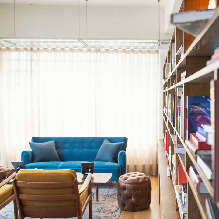
One of the common misconceptions about the spaces we live in is that as long as you can do what you need to do in a building or room, it doesn’t really matter how it looks. There is perhaps an ideal in our minds that being surrounded by good aesthetics is simply a surface concern and how something looks doesn't really affect us on a deeper level. In my earlier days in engineering I certainly felt the push to eschew aesthetics in favor of a product that works and meets the budget.
Concerning architecture and interior design, there is sometimes a philosophy that we can make use of buildings and rooms for their intended purpose while paying no mind to their appearance and suffer no ill effects. As long as we can set up 100 desks in a building then our employees will be able to get their work done. If the room has a bed and some curtains on the windows then that should satisfy our need for sleep.

The bland, lifeless feeling I get from simply writing those two previous sentences tells me there’s something missing when we settle for function over beauty. R. Buckminster Fuller perhaps said it best, “When I am working on a problem, I never think about beauty........ but when I have finished, if the solution is not beautiful, I know it is wrong.” There is more to our environment than simply functionality.

In 1944, while addressing a debate in Parliament about the reconstruction of London after the Second World War, Winston Churchill said, “We shape our buildings, then our buildings shape us.” His keen observation brought into focus the idea that the environment we construct around us greatly influences how we feel, think, and act. The effect is mostly subconscious, but we have all experienced it. You may notice your mood turning anxious when you enter a cluttered basement or discouraged after spending 9 hours in a bland, beige cubicle farm or relaxed and happy in your friend's warm, cozy living room.

What evidence do we have that aesthetics affect our moods and outlook? Can an intentionally-designed, aesthetically-pleasing building, room or object help us to feel happier, more optimistic, or more connected to others?

Fortunately, some very insightful studies have been conducted which seek to answer our questions about how our surroundings influence us. One of the earliest and perhaps most influential came in 1956 when the positive psychologist Abraham Maslow studied whether a person’s surroundings affected their mental outlook.
In the study, he decorated three rooms in his university's lab in three distinctive styles. The first room was the Beautiful Room because it was carefully arranged and decorated to be as comfortable and aesthetically pleasing as possible. The second was designated the Average Room since it looked like an average university professor’s office. The third was coined the Ugly Room, and it was a poorly lit janitor’s supply room filled with cleaning supplies, trash, and broken furniture.
Each participant in the study was assigned to one of the three rooms. While in their assigned room, they were asked to rate a series of portrait photographs on a scale from positive to negative. A clear pattern emerged. Participants assigned to the Beautiful Room consistently gave more positive ratings to the portraits than those in the Ugly Room. That’s some amazing evidence!

We might ideally believe that our mood or judgement is immune to our environment, but we are in fact quite influenced by our surroundings. When we walk into a well-designed space that’s intentionally arranged and carefully appointed, we see others in a more positive light. In a well-designed space, our mood improves, we can think more clearly, be more productive, have more fun, and be happier. It pays to make your space look good.
In the News: Atomic Ranch Magazine
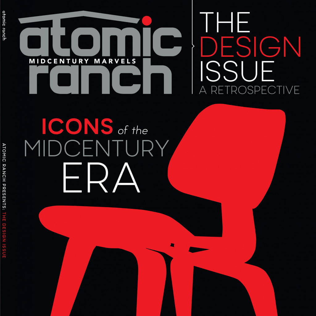
A huge thank you to Sarah Jane Stone, the editor at Atomic Ranch magazine, for reaching out to me about including two Ciseal products in their recent issues.
First, the Michigan Left Lamp was featured in the 2016 Design Issue as one of their lighting picks:

Then, the Aspen Magazine Rack was included in the Winter 2016/2017 issue's Cool Stuff section highlighting Retro Done Right:


I could not be more excited! Thank you, Atomic Ranch!
Ciseal's Guide to Palm Springs Modernism Week
Photo: Casa Runner
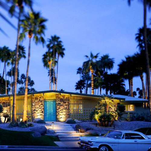
Every February, Palm Springs Modernism Week attracts thousands of Modernist fans from across the globe. For mid century modern buffs, it’s quite possibly the most wonderful 10 days of the year. There is so much to see and do during Modernism Week that it can be difficult to narrow it down to what you have time for - even if you’re in town for the whole 10 days. To make the most of what there is to do, it helps to do some research before you go. Hopefully this guide will help you narrow it down a bit to help you make the most of what there is to do during your trip.
Many official Modernism Week events sell out months in advance, so it would be prudent to check out www.modernismweek.com as soon as possible to reserve your spot. Some events can be reserved closer to the day of the event for the more casual planners among us, but it doesn’t hurt to reserve a spot as soon as possible. There’s a great mix of things to do as well as price points associated with the various events (from free to several hundred dollars). Here are some of the most popular things to do and events to attend during Modernism Week:
CAMP

Photo: Atomic Ranch
The first place you will want to go once you arrive in Palm Springs is CAMP (the Community and Meeting Place). CAMP is located in downtown Palm Springs just next door to Palm Springs Art Museum’s Architecture & Design Center. It’s essentially the festival center where you can get yourself oriented to everything that’s going on in town, purchase event tickets, attend a lecture, take advantage of a free event or exhibit, or pick up some souvenirs. CAMP is also where most tours start from, so it’s good to have it on your radar.
House Tours

Photo: Modernism Week
Historic home tours offer the rare opportunity to walk through historic mid century modern masterpieces like the Desert Palisades Al Beadle Home and many others. I highly recommend doing at least one of these on your trip. A slightly different house tour is the Show House which brings together various tastemakers to create unique rooms in one house. It’s pure interior design eye candy where you’ll find so many ideas that you won’t know what to do with them all.
Double Decker Bus Tours

Photo: Modernism Week
These tours are awesome because the height of the bus allows you to see over walls and landscaping at street level and take in the glorious architecture. You also get a very informative narrator who will share all of the interesting bits about what you’re seeing.
Walking Tours

Photo: Modernism Week
You can actually do a walking tour on your own year-round if you download the Palm Springs Modern: Mid-Century Architecture Tours app for iPhone or Android for just $5. It offers three different guided tours and will give you directions from one stop to the next. It even provides photos and information about the architect and the building itself. If you’d prefer a human-led tour, Modernism Week has several exclusive guided walking tours in multiple neighborhoods.
Preview and Cocktail Parties

Photo: Modernism Week
Preview parties are the perfect way to get a sneak peak of all of the fabulous exhibitors or step inside an historic home and experience what it would be like to attend a cocktail party in the Mad Men era. Many of these events are previews, so they’re going to happen before Modernism Week starts, but some of the cocktail parties happen throughout the week, and they’re a great chance to have a bit more of an intimate experience inside an architectural gem.
Exhibits, Lectures & Films

Photo: Modernism Week
CAMP (The Community and Meeting Place), The Palm Springs Public Library, and The Palm Springs Art Museum all host architectural exhibits, lectures and films specifically for Modernism Week, so be sure to check their schedules for the days you will be in town.
Palm Springs Modernism Show and Sale

Photo: Modernism Week
This is the show that started Modernism Week, and it’s easily the most well attended event of the week. It is a can’t-miss treasure chest of vintage and new mid century modern furniture, lighting, prints, sculpture, and decorative arts. So, if you’ve had your eye on a George Nelson lamp, an elusive Herman Miller chair, or a Charles and Ray Eames bent ply splint this is where you’re most likely to find it. You’ll find it at the Palm Springs Convention Center.
Palm Springs Fine Art Fair

Photo: incollect
While at the Convention Center, make your way over to the The Palm Springs Fine Art Fair which features post-war and contemporary photography, sculpture and paintings. It is a huge fair with over 50 exhibitors, so there’s plenty of interesting pieces to see for everyone.
This was just a small taste of all that there is to do during Modernism Week. Be sure to peruse www.modernismweek.com before you leave on your trip. There is simply too much to see and do, so please do your homework before you go! Modernism Week is absolutely a wonderful time to immerse yourself in the best that Palm Springs has to offer.


