The Ciseal Blog
What is Mid Century Modern?
Here at Ciseal, our focus is on making Mid Century inspired furniture, lighting, and home decor for the modern day. In this series of blog articles, we’re going to dive into defining Mid Century design for your home, share why we love Mid Century, and provide some tips for adding some Mid Century style to your home. This week, we’re kicking off the series by exploring a question we get asked quite a bit: What is Midcentury Modern?
When you hear “Midcentury Modern” what do you think? Is it the set of Mad Men? Maybe it’s your parents' or grandparents’ dated furniture and decor. It could conjure up images of bright colors and earthy wood tones. Or tacky wood paneling and a well-past-their-prime shag rugs. Mid Century is such a broad category, and everyone seems to have their own definition and interpretation - which we love!
Most homes that are considered Midcentury Modern were built between the 1940’s and 1970’s, but modern interpretations continue to be built today. The originators of the style were modern architects including Walter Gropius and Marcel Breuer who fled Nazi Germany for the United States before World War II. Other influential designers include Ludwig Mies van der Rohe who was the Architecture department head at the Illinois Institute of Technology, Frank Lloyd Wright students Richard Neutra and Rudolph Schindler, and Cranbrook Academy of Art Alums Charles and Ray Eames and Eero Saarinen.
World War II was important to the style because it necessitated experimental technologies and materials like plywood, steel, and aluminum which went on to be used extensively in buildings and decor after the war. According to Sian Winship, president of the Southern California Chapter of the Society of Architectural Historians, “The birth of midcentury modern was after the war. The houses had open floor plans and giant sliding-glass doors, which encouraged people to go outside and be healthy. In a traditional home, the window height is 4 to 5 feet, and you can’t see out as a child. With these walls of glass, children became engaged and open-minded because the environment stimulated the senses in a different way.”

Photo by Midwestliving.com
The ultimate goal of Midcentury Modern design is to inspire and encourage us to explore the world around us in new ways. At it’s roots, Midcentury Modern architecture utilizes four key elements to blend our interiors with the world around us:
-
Extensive glass: Large windows and sliding-glass doors drape the outside walls of Midcentury homes to allow natural light to flood indoors.
-
Open design concepts: Midcentury Modern homes will have partial walls, small sets of steps between rooms to create split-level spaces, and cabinets of varying heights to create defined areas in otherwise open spaces.
-
Simplicity of form: The flat planes and geometric lines of Midcentury houses create low, sweeping flat or gabled rooflines, repetitive linear patterns in support beams and posts, and brick- or stone-clad chimneys that anchor the design.
-
Connection with nature: Midcentury rooms have a connection to nature through expansive windows or multiple access points to draw the residents outside.
A few famous examples of Midcentury Modern homes include:
Stahl House - Case Study House 22

Photo by Midcenturyhome.com
Eichler Homes (there are a lot of them!)

Photo by MCMdaily.com
Jens Risom's Block Island Home

Photo by Dwell.com
Farnsworth House

Photo by Farnsworthhouse.org
So, that’s your primer on how Midcentury Modern came to be and how it’s defined. Next week we’re going to explore the specific reasons why we here at Ciseal love Midcentury design. You can read that article here: Why We Love Mid Century Modern.
Inspiration Friday: Frank Lloyd Wright's Fallingwater
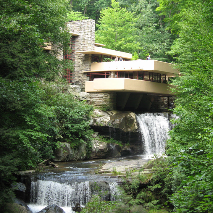
Fallingwater (Roadtrippers).
Frank Lloyd Wright’s distinguished career centers on his most famous structure: Fallingwater. Originally a weekend home he designed in 1935 for Liliane and Edgar J. Kaufmann, it’s sparked wonder for many who dream of what it would be like to live over a waterfall in the remote forest of western Pennsylvania. In exploring the history of the house and Wright himself, I’ve come to appreciate that it represents the rebirth of Wright's career after a long period marked by frustration and unfinished projects. It is a masterful application of Wright’s unique style, and I hope you enjoy the history and thoughtful design of this home as much as I do.
During the two decades preceding Fallingwater, Wright saw his personal and financial lives collapse. His precious Wisconsin home, Taliesin, had two fires, and then he had to give it up due to bankruptcy proceedings and divorce litigation. Between 1925 and 1934 only five of his commissions were built, and he struggled to survive financially. The general public assumed he had retired. He needed a project that would rescue him from the doldrums – both financially and publicly.
For Wright, the problem with modern architecture was how to harness new materials to create a humane environment. Due to Hitler forcing many artists and architects out of Europe and after a 1932 exhibition at the Museum of Modern Art the International style began to take hold in America. Wright, however, disliked its sterility, boxiness and disregard for the individual and site. While working under Louis Henry Sullivan in the late 1800s, Wright learned how to synthesize the sensuous, tactile, emotion-based architecture theories of John Ruskin with the structural rationalism approach of the modernists. For example, the Wainwright skyscraper of 1890 in St. Louis, Missouri is a successful culmination of rational use of modern materials with richly decorated details.

Wainwright Building (Zbaren)
Fallingwater displays Wright’s distinct modern yet organic architectural style in what proves to be his most successful union of building and site. Wright took what he learned from Sullivan, Ruskin and even the International Style architects (although he would not care to admit it) and developed his own organic-modern style. Wright’s homes displayed unifying themes such as,
- The effort to harmonize with their surroundings through low-hipped roofs and horizontal extension,
- The use of natural materials,
- Restraint in the use of ornament, and
- Unification of architecture, nature, and interior design to create a modern home that’s fully integrated in it’s site.
Though Wright referenced his predecessors and contemporaries, his style was more natural and personal than the Internationalists, more innovative in the use of industrial materials and methods than Ruskin, and less decorated than Sullivan.
To describe his unique style, Wright said in his essay “The Natural House” that the proper house should be one that is “Integral to site; integral to environment; integral to the life of the inhabitants.” Houses had to be fitted to the client as well as the land it sits on, and the design should be so in tune with the surrounding landscape that the site would be lacking without it. He called the style “organic architecture.” His style was uniquely his, and all that Wright needed to emerge from the longest drought of his career was a client who shared the same ideals.

The Kaufmann Family: Edgar Jr. (center) with E.J. (left) and Liliane (Post-Gazette)
Liliane and Edgar J. Kaufmann were wealthy Pittsburgh department store owners who were looking for a weekend retreat. They were committed to bringing their Bear Run property back to life from years of overworking by the mining and lumber industries. Mr. Kaufmann cleared away distressed or dead trees and re-forested the property with native trees and plants. He also revitalized the fish and game on property by providing grazing lands and winter feeding areas.
For their weekend home on their beloved property, the Kaufmanns wanted to put the land before architecture. They had no interest in building a huge castle or chalet like the vacation homes of their contemporaries. It was of utmost importance that this home would live in harmony with the land and even enhance the natural elements around it. They hoped to build a country house in which they could renew themselves in nature.
Even though modern architecture was not very popular in the United States in the early 1930s, The Kaufmanns grew to appreciate the modern aesthetic through their many visits to Germany and California where Bauhaus, Modern and International Style architecture had taken hold. With their appreciation for nature and their interest in modern architecture it only seemed natural for them to approach Frank Lloyd Wright and ask him to design their weekend home.
In describing his first impressions of the Kaufmann’s property, Wright commented: “There in a beautiful forest was a solid, high rock ledge rising beside a waterfall and the natural thing seemed to be to cantilever the house from the rock bank over the falling water…Then came (of course) Mr. Kaufmann’s love for the beautiful site. He loved the site where the house was built and liked to listen to the waterfall. So that was a prime motive in the design. I think you can hear the waterfall when you look at the design.” Wright’s prime motivation for the design was to preserve the site and enhance the natural elements around it.
Though the location on the side of a steep hill was challenging, it demanded that Wright be creative with the design so that it not only conformed to the site, but also enhanced its beauty. The house would be anchored to four giant sandstone boulders at the top of the twenty-foot falls. Cantilevering the house over the falls would imitate the layered sandstone ledges that extend from the boulders alongside the stream. Terraces extend to different lengths and in all different directions to reflect the trees surrounding the site. The colors he chose for the finishes were pulled right from the landscape around the house. Wright loved to abstract pieces of the landscape into visual design elements of his architectural creations.

Fallingwater (Laurel Highlands)
The masonry walls of the building core were constructed from sandstone quarried on the site, and they were laid to resemble the cliffs bordering the house. Some stones thicker, some longer, some jutting out a bit further than the others, and with nearly invisible mortar joints, the stone looks as if it was naturally stratified. The creation of this stone core creates a strong base that makes Fallingwater appear as if it is an extension of the waterfall.

Masonry Detail (Wright-House)
From this central stone core, terraces and canopies constructed out of reinforced concrete create clean horizontal planes that contrast with the strong, vertical stone walls. The first floor slab extends eighteen feet over the stream. To Wright, the composition of terraces extending from the stone core is reminiscent of branches extending from a tree trunk. Because the terraces were cantilevered through the use of steel reinforced concrete, the outer walls were not load bearing and could be open to nature through wall-to-wall windows.
The Kaufmanns wanted above all a place to enjoy nature, so it is only natural that the spaces inside Fallingwater bridge the gap between nature and shelter. The entry to Fallingwater is relatively nondescript, but once inside the visitors are drawn through the uninterrupted interior to the expansive windows and eventually back outside. True to his organic architecture style, Wright believed that buildings should provide a special kind of shelter: “I began to see a building primarily not as a cave but a broad shelter in the open, related to the vista without and the vista within.” The interior of a house should feel safe and protected, but in no way cut off from the natural world around it. The massive stone walls at the north side of the house provide the sense of protection that Wright desires. In contrast, the wall of windows on the opposite side opens up views of the vista over the waterfall, and allow for abundant light to shine through year-round.

Interior (Fallingwater)
The windows themselves create a linear contrast to the natural, irregular stone walls and the natural world outside. To further enhance the view, the windows are framed in a color Wright called Cherokee Red. He used this color extensively in his organic architecture because it is a deep, natural red color that is reminiscent of fall foliage or iron’s natural patina. The metal serves as picture frames for the ever-changing views of the outdoors.
The living area bridges nature and shelter in other ways as well. In the living room, a clear skylight frames the sky over a dramatic staircase that plunges directly to the water below, bringing the outside inside: water and sky unite. The bathroom off the main bedroom features a sink that is set in an alcove of windows like a window box. Even invisible corner joints serve to make the view to the outdoors seemingly seamless.

Skylight from living room (Solitary Dog Sculptor).

Stairs from exterior (Allyson Scott).
Wright designed the house so that the boulders that the house is anchored to will peek through the waxed flagstone floor – again abstracting the natural world. With the boulders peeking through the shiny, water-like floor, it is as if the interior is sitting in the stream outside. The focal point of the living room is the boulder-framed fireplace upon which the entire house is centered. The kitchen includes another boulder in the floor that creeps inside, providing a place to set pots as the inside and outside become entwined with only a pane of glass in between. Even hallways are treated to the outdoors with man-made stone walls giving way to natural boulders.

Fireplace detail (Artsology).
The furnishings inside Fallingwater are mostly custom designed by Wright to reiterate the linear, cantilevered forms of the exterior. Within the living room, Wright defines areas for dining, listening to music, reading, and writing by varying the ceiling level, quality of light with direct or recessed lighting, furnishings, and wall sections. The black walnut veneered furniture also counters the straight, horizontal lines with some curved edges and soft, upholstered accents. The natural tones of the upholstery fabric enhance the simple palette of the outdoors. As a whole, the interior design reflects and enhances the landscape seen all around it.

Furnishing detail (Sandstead).
I hope you enjoyed learning some of the history of Fallingwater, what led to it’s design, and how thoughtfully it was executed. It is the ultimate display of Wright's organic architecture style with its unification of modernism and landscape, but it may have never happened if not for the Kaufmann family and their appreciation for both modern design and preserving nature. This home is unique in architecture in that it displays both Wright’s creative genius and the natural landscape surrounding it. If you ever find yourself in western Pennsylvania, I highly recommend stopping by for a tour.
Inspiration Friday: Walt Disney's Original E.P.C.O.T.
The big thinkers of the Mid Century era continue to inspire me in my perspectives on life and work, and one of my biggest inspirations is Walt Disney. I previously wrote about my fascination with Disney concept artist Herbert Ryman on this blog. My favorite of Ryman’s work is his concept drawings for Walt Disney’s original E.P.C.O.T. (Experimental Prototype Community of Tomorrow) project. You’re perhaps familiar with Walt Disney World’s Epcot theme park, but what many don’t realize is that Epcot started off as a much bigger idea.
Although what we see on Disney’s Florida property today is a collection of theme parks based off of Disneyland in California, Walt Disney’s original intention was much more than adding some East Coast theme parks to his portfolio. He wanted to shift the paradigm of urban planning. Disney’s original EPCOT plan was to create a new Utopian City of Tomorrow. In The Florida Film, a 24-minute blueprint for his Florida project, Disney said: “By far the most important part of our Florida Project — in fact, the heart of everything we’ll be doing in Disney World — will be our experimental prototype community of tomorrow. We call it EPCOT.”

(Photo: theoriginalepcot.com)
About his motivation for creating E.P.C.O.T. Walt explained, “I don’t believe there is a challenge anywhere in the world that’s more important to people everywhere than finding solutions to the problems of our cities.” Veteran Disney animator and executive John Hench explained, “Solving the problems of the city obsessed him. When Walt went to New York, he complained about the noise of garbage cans waking him up in the middle of the night. He thought if you could set an example, people would make changes in their own home town.”
Even in the early 1960s, Walt Disney saw that America’s cities were in need of an upgrade. Since most Americans in the 1960s were desperately enamored with the automobile, urban planners prioritized projects that would ease the increasing traffic. Bridges and highways came first with people and neighborhoods relegated to whatever was left of the budget and landscape. Seeing the cultural and environmental cost associated with more and more concrete, Disney created what has proved to be a forward-thinking strategy that we’re just starting to implement today.

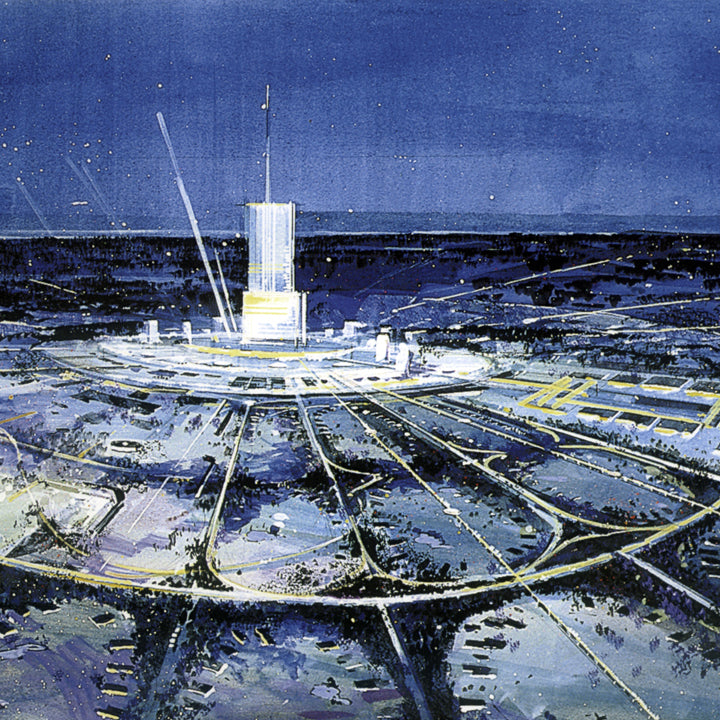
Rendering of E.P.C.O.T./“Progress City” 1965 (Photo: Progress City USA)
Disney’s original Experimental Prototype Community of Tomorrow (E.P.C.O.T.) was to be a community of the future that would be a proving ground of new ideas for urban living. Walt Disney described it like this: “E.P.C.O.T. will take its cue from the new ideas and new technologies that are emerging from the forefront of American industry. It will be a community of tomorrow that will never be completed. It will always be showcasing and testing and demonstrating new materials and systems.” Walt and his Imagineers had learned a great deal about environmental and building architecture in relation to crowds while developing Disneyland, and he wanted to see how those lessons could be applied to cities.

EPCOT Radial Design 1966 (Photo: theoriginalepcot)
The plan for E.P.C.O.T. was to build a brand new community concept from the ground up. Taking inspiration to Disney’s clean, controlled environment and layout of Disneyland Park in California, it would be designed in a circular shape with a central hub. The central hub would be the foundation of the community with business and commercial activities centrally located with easy access via a modern transportation hub. The main mode of transportation would be Monorails and PeopleMovers, and all automobile traffic would be underground to keep pedestrians safe above ground. The rest of the community would fan out from the hub like spokes on a wheel. Community buildings, parks, and schools would fill in the area around the hub. On the perimeter of the community, suburb-like residential neighborhoods would provide bucolic housing for the 20,000 or so residents.

E.P.C.O.T.’s Transportation Lobby (Photo: Progress City USA)

The Greenbelt, 1966 (Photo: theoriginalepcot)
Sadly, Walt Disney passed away before the Magic Kingdom opened and his vision of E.P.C.O.T was not able to be brought into reality without his continued cultivation. Some of E.P.C.O.T.’s ideas came to fruition in the theme park that bears it’s name. Epcot's Future World is filled with futuristic thrill rides which encourage guests to stretch their preconceived notions about transportation, design, science, and the world around us. The theme park's World Showcase is a slightly altered version of the original E.P.C.O.T. International Shopping District where you can sample food and drink from around the world. Walt Disney World itself is a testament to Disney’s crowd management and mass transportation ideas with it’s ability to welcome hundreds of thousands of visitors each day and efficiently provide transportation, housing and food.

Concept for the “Spanish District” of EPCOT’s International Shopping Center (Photo: Progress City USA)
Disney’s hope was that if the E.P.C.O.T. prototype was successful, it could be replicated in other areas around the country. Even today, the E.P.C.O.T. concepts are inspiring urban planners and developers who want to make living within a city more efficient and enjoyable. In Detroit, for instance - a city that’s been very rooted in the automobile culture for decades - we’ve seen an increase in people moving into more urban areas where developers have begun to create little cities within the city. These little cities create a compact combination residential space, office buildings, hotels, shopping and entertainment districts in one walkable area. The addition of Detroit's first light rail line is another E.P.C.O.T. concept that promises to ease the traffic getting to and from the city and the outlying suburbs. So, in many ways, Walt Disney’s vision is being realized still today.

International Shopping Center, 1966 (Photo: theoriginalepcot)
While the development of the full EPCOT project never came to be, the overarching ideals still ring true today - perhaps more than ever. The concerns about automobile traffic, land management, and city planning that Walt addressed in the 1960s are still things we’re working to improve on and find solutions for. It’s exciting to me to see Walt Disney’s ideas being implemented in my hometown to make city life a bit easier and enjoyable today - 50 years after his passing.
Inspiration Friday: Buckminster Fuller's Dymaxion House
Being both a mechanical engineer and industrial designer, I am always on the lookout for products that push the theoretical boundaries of technology and challenge the status quo. Some designs might not be massively popular or even go into production, but they serve as inspiration for how to apply new technology in innovative, sometimes unintended ways. These objects change the way other designers look at the world. Buckminster Fuller’s Dymaxion House at The Henry Ford demonstrates a new way of designing a shelter, and while it was never produced on a mass scale it challenged the way other designers and architects viewed technology, manufacturing, and design.

Buckminster Fuller, Photo: PBS
R. Buckminster Fuller was a philosopher, inventor, and designer born in Milton, Massachusetts on July 12, 1895. “Bucky” Fuller, as he was commonly known, wanted to make the world work better for all of humanity. He is best known as the inventor of the geodesic dome, of which over 300,000 have been constructed worldwide. Throughout his career, he stressed responsible conservation of the earth’s resources, and emphasized technological efficiency by creating objects that do more with less. His impact on the world is found in his continued influence upon generations of designers, architects, scientists and artists working to create a more sustainable planet.

The Biosphere Environment Museum, Montreal, Quebec, Canada, Photo: Architectural Digest
Bucky started thinking about the Dymaxion House concept in 1927. At the time, the aircraft industry was developing new technologies that created strong, lightweight structures and materials. In this same era, traditional buildings depended on compression on their walls to support the roof. Bucky found this paradox absurd. He knew that modern technology had developed tensile materials which are many times stronger in relation to their weight than compression materials. If Bucky could develop a house that was designed to use a tension structure he could reduce weight, use fewer materials, and therefore reduce the cost. In the end, Bucky saw this design as a mass-produced house that could potentially solve the world’s shelter problems.

Dymaxion House Drawing, Photo: Archdaily.com
After World War II, Fuller decided that the time was right to produce the Dymaxion House. He convinced Beech Aircraft of Wichita, Kansas to work with him since the materials used in the house were very similar to those used in aircraft and after the war the aircraft factory would have extra capacity. In 1945 he introduced the Wichita House, which was an updated version of the Dymaxion House. Bucky had a hard time compromising on his design, and the house never made it to full production. Only two prototypes of the house were ever produced.

Dymaxion House Construction, Photo: HPEF
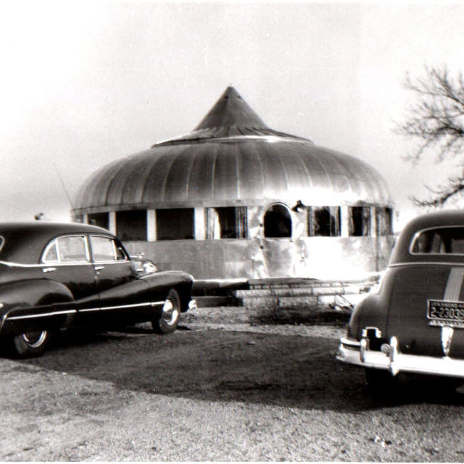
The Dymaxion House carried Corbusier’s “machine-for-living” concept to the next level. The house was designed to be mass-produced, affordable, easily built on site, air-delivered and environmentally efficient. The living space was suspended using tensile materials from a central mast. This reduced the home’s footprint to a pillar in the ground, and the area under the living space could be landscaped. Structure similar to the spokes of a bicycle wheel hung down from the mast to suspend the domed roof, and beams radiated out to support the floor. Since they were not load-bearing, the outer walls were made of glass with sliding panels to allow for continuous, natural air-conditioning through the central mast. The house was designed to be easily movable and independent of its location so if the homeowner decided to move, the entire thing could be picked up and re-planted anywhere.

Dymaxion House Exterior, Photo: TournaTalk
Fuller made many design decisions for the house that affected both its form and function. At 1,017 square feet, and with two bedrooms the Dymaxion House was designed for single families of no more than four people. In addition to the bedrooms, the house features a foyer, living room, dining room, kitchen, kitchen storage, a Dymaxion modular bathroom, stainless steel fireplace, O-Volving shelves, and revolving shoe and clothes racks. It was supposed to cost about $6,500 in 1946 which was about the cost of a luxury automobile.

Dymaxion House Interior, Photo: Dead Inventors Appreciation Society
The exterior of the house was made out of aluminum because Bucky wanted to use this relatively new material for its strength and low weight. It was ideal for a mass-produced, transportable, easily disassembled house that could withstand strong storms such as tornados. Aluminum was also already familiar to aircraft manufacturers whom Bucky saw as likely partners in the production of the houses after the war. The round shape of the house reduces the amount of materials needed while maintaining strength.

Dymaxion House at The Henry Ford Museum, Dearborn, Michigan, Photo: The Henry Ford
Critics of the Dymaxion House point out that its design is inflexible and it completely disregards the site upon which it is built. A more customizable design would make it a true home for the masses because each family could choose the elements that are important to them instead of settling on one design for all. In addition, Fuller’s choice of energy-intensive materials like aluminum apparently disregards his desire to create an environmentally sensitive housing solution. However, Fuller chose aluminum for its low weight, strength, and durability – all factors that over the lifetime of the product would compensate for its initial cost.
Buckminster Fuller’s Dymaxion House is an example of how technology and engineering can inform a design and help to create a concept that challenges the status quo. He questioned how houses were traditionally constructed and he applied new technology to help solve problems he saw in their manufacture, structure and assembly. It’s a great example of an object that challenges future designers to continually stretch boundaries.
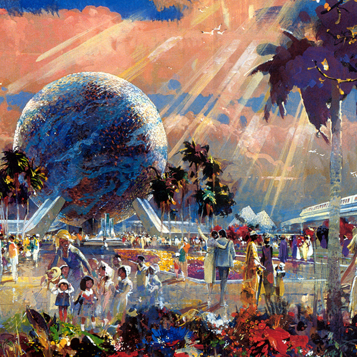
Inspiration Friday: Herbert Ryman's Disney Concept Art
Photo: Micechat.com
I first learned about Herbert D. Ryman (1910-1989) while on vacation in Walt Disney World, and his art has been inspiring me ever since. He was both a commercial and a fine artist who had an insatiable need to sketch the world around him and bring fantastic ideas to life through pen, ink, watercolor, and oil. His work as a Disney concept artist set the tone for every Disney theme park until he died in 1989.

Herbert Ryman at Work (Photo: designingdisney.com)
“My own dream of happiness would be to live in every spot on our globe. To see and study and record and most of all, to understand. And to pass on in some tangible form a fragment of that enthusiasm and love.” –Herbert D. Ryman
His concept paintings were the first blueprint for Disney Imagineers to create their trademark fun-filled parks which transport guests into different worlds in time and space. The story goes that he simply sat d own at his drawing table and drew as Walt Disney described to him his dream for a fresh and clean version of the creepy, run-down amusement parks of the day. The ease in his style, the whimsy of the lines, the tones of the bold colors, and the composition all combine to give the viewer a sense of “what’s next, what’s around the corner?” - just like you feel in the parks themselves.

Photo: Micechat.com
“Be inordinately infatuated with the world—its people, its history, and geography. Let your eyes speak to your heart and your heart to your hand.” –Herbert D. Ryman
Ryman’s extraordinary talent was in his ability to take ideas that resided in the excited mess of the mind and extract their essence into inspiring concept art. His original concept drawing for Disneyland is what earned Disney the financial backing to continue the project and bring it into fruition. Without Ryman's ability to put beautiful ideas on paper, we may never have seen Walt Disney’s true vision for his parks come into reality.

Disneyland Schematic (Photo: disunplugged.com)
Ryman’s concept art continues to be referenced by Disney imagineers, and they use it to inspire updates to the parks even today. Take a look at some more of his artwork below and let it inspire you to create a more beautiful tomorrow.

American Adventure, concept painting, Epcot, 1979 (Photo: disunplugged.com)

Horizons Building Concept (Photo: disneyatwork.com)

The Land Pavilion Concept (Photo: disneyatwork.com)

Central Plaza Concept Art, Tokyo Disneyland (Photo: disneyandmore.blogspot.com)

EPCOT Center Concept (Photo: Insights and Sounds)
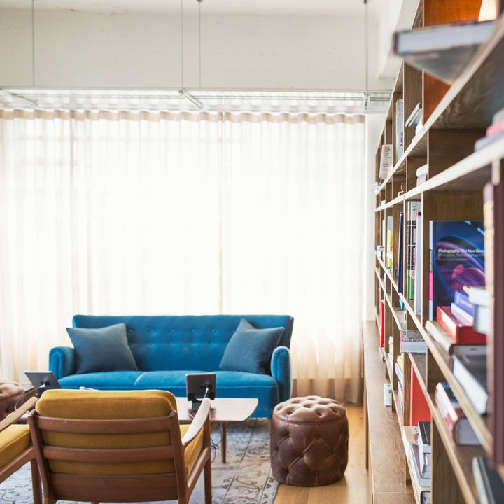
Why Beautiful Design Is Good For You
One of the common misconceptions about the spaces we live in is that as long as you can do what you need to do in a building or room, it doesn’t really matter how it looks. There is perhaps an ideal in our minds that being surrounded by good aesthetics is simply a surface concern and how something looks doesn't really affect us on a deeper level. In my earlier days in engineering I certainly felt the push to eschew aesthetics in favor of a product that works and meets the budget.
Concerning architecture and interior design, there is sometimes a philosophy that we can make use of buildings and rooms for their intended purpose while paying no mind to their appearance and suffer no ill effects. As long as we can set up 100 desks in a building then our employees will be able to get their work done. If the room has a bed and some curtains on the windows then that should satisfy our need for sleep.

The bland, lifeless feeling I get from simply writing those two previous sentences tells me there’s something missing when we settle for function over beauty. R. Buckminster Fuller perhaps said it best, “When I am working on a problem, I never think about beauty........ but when I have finished, if the solution is not beautiful, I know it is wrong.” There is more to our environment than simply functionality.

In 1944, while addressing a debate in Parliament about the reconstruction of London after the Second World War, Winston Churchill said, “We shape our buildings, then our buildings shape us.” His keen observation brought into focus the idea that the environment we construct around us greatly influences how we feel, think, and act. The effect is mostly subconscious, but we have all experienced it. You may notice your mood turning anxious when you enter a cluttered basement or discouraged after spending 9 hours in a bland, beige cubicle farm or relaxed and happy in your friend's warm, cozy living room.

What evidence do we have that aesthetics affect our moods and outlook? Can an intentionally-designed, aesthetically-pleasing building, room or object help us to feel happier, more optimistic, or more connected to others?

Fortunately, some very insightful studies have been conducted which seek to answer our questions about how our surroundings influence us. One of the earliest and perhaps most influential came in 1956 when the positive psychologist Abraham Maslow studied whether a person’s surroundings affected their mental outlook.
In the study, he decorated three rooms in his university's lab in three distinctive styles. The first room was the Beautiful Room because it was carefully arranged and decorated to be as comfortable and aesthetically pleasing as possible. The second was designated the Average Room since it looked like an average university professor’s office. The third was coined the Ugly Room, and it was a poorly lit janitor’s supply room filled with cleaning supplies, trash, and broken furniture.
Each participant in the study was assigned to one of the three rooms. While in their assigned room, they were asked to rate a series of portrait photographs on a scale from positive to negative. A clear pattern emerged. Participants assigned to the Beautiful Room consistently gave more positive ratings to the portraits than those in the Ugly Room. That’s some amazing evidence!

We might ideally believe that our mood or judgement is immune to our environment, but we are in fact quite influenced by our surroundings. When we walk into a well-designed space that’s intentionally arranged and carefully appointed, we see others in a more positive light. In a well-designed space, our mood improves, we can think more clearly, be more productive, have more fun, and be happier. It pays to make your space look good.
8 Mid Century Modern Inspired Home Decor Items We're Loving Right Now
It’s no secret that I’m a big fan of Mid Century Modern decor. The clean lines, pops of bold color, and natural materials make my heart flutter a bit at each glance. Each product I design is majorly influenced by the vintage Mid Century decor of the 50’s and 60’s. But I’m not the only one. There are countless others right here in America who are inspired by the mid mod classics to design and make their own take on modern decor today.
That’s why I’m excited to share with you some of my favorite Mid Century Modern inspired home decor items designed and made by hand right here in the USA.
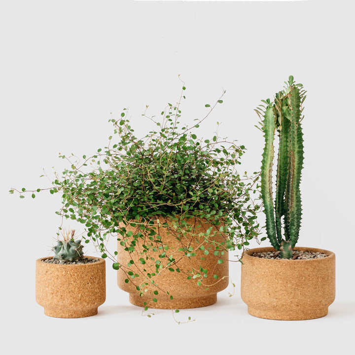
Modern Cork Planters by Melanie Abrantes
These hand-turned cork planters were inspired by vintage planters from the 1960’s. They’re naturally porous, so they keep plants at the perfect moisture level. Melanie makes them available in three sizes for all sizes of houseplants. Take a look at Melanie Abrantes’ online shop.
Perpetual Calendar by Tait Design
Tait Design’s hanging wall calendar is designed to be used year after year. It’s design is inspired by vintage volvelles. The three circles move to mark the day, date and month - perfect for the home or office. Find out more at Tait Design’s online shop.
Walnut Serving Trays by Hunt & Noyer
Fellow Michigan-based designer Kyle Huntoon makes these handsome trays in three sizes for any use you can think of. The small tray is a perfect desk caddy to keep all of your small items in one tidy place. The medium tray holds all of those important pieces of mail or paper together and neatly stacked. And the largest size is made for entertaining - like carrying drink and apps and such. Check them out at Hunt & Noyer’s website.
SQR Box + Sliced Lid by IN.SEK Design
IN.SEK Design specializes in combining natural concrete and wood in clean shapes that complement any mid century modernist’s decor. Their bowls, trays, hooks, and planters are to die for, but I’m particularly smitten about their gorgeous boxes. Each one is a unique design that holds your prized possessions safely and beautifully. Check them out at IN.SEK’s online shop.
Rope Box by Light + Ladder
Light + Ladder’s Rope Box in Walnut hangs from any wall where you want some decorative storage. Hang it next to your front door to store your keys, wallet, or phone while keeping them out of sight. Find out more at Light + Ladder’s online shop.
Modern Birdhouse by KoolBird
So maybe a birdhouse isn't your typical home decor item, but hear me out. KoolBird’s bird houses are modern takes on mid century shapes. Imagine hanging one of these in a child'd bedroom or anywhere that might want a bit of lighthearted whimsy. Find out more at KoolBird’s online shop.
Aspen Magazine Rack by Ciseal
I’d be a bit remiss to not include my most favorite home decor item of all time - The Aspen Magazine Rack. But seriously, this gorgeously modern piece brings a bit of nature-inspired beauty indoors and onto your coffee table or desk. It’s a clean, minimal way to corral magazines, newspapers, mail, documents, or your favorite trinkets and treasures. Check them out in Ciseal’s online shop.
It was tough narrowing it down to eight! These are just a small sample of the mid century inspired home goods that are being made in the USA right now. Whether it’s these talented designer/makers or ones closer to your home, please support your local small businesses!

Midland - Michigan's Midcentury Modern Destination
It’s June, and every year around this time I start dreaming about road trips. Being born and raised in Michigan, some of my favorite destinations like Traverse City, Mackinac Island, Tahquamenon Falls and Pictured Rocks are “up north.” While driving to these destinations, I’m usually dreaming about soaking in their natural beauty on quiet hikes, sampling local brews and eats, and relaxing under the stars. These dreams are usually in full swing as we drive through another destination that most wouldn’t even think to stop at and explore: Midland.
"Midland? Isn’t that just one of those towns we pass on the way up north?” Sure, to some Midland isn’t worth the effort - they’ve got to get on the last ferry to Mackinac, but to others it’s a hidden gem. I wasn’t aware of Midland’s awesomeness until I had a summer internship at one of the local chemical companies. While there, I learned that Midland isn’t just another town on the way up north - it’s a city that's full of gorgeous, authentic mid century architecture.

Centrally located in the palm of Michigan’s lower peninsula, Midland is a mecca for midcentury modern enthusiasts. Architect Alden B. Dow and his students designed over 250 homes, businesses, churches, and government buildings in the mid-20th century American modern style of architecture. For a city of only about 40,000 people that’s certainly quite a few! No other city of similar size even comes close to the amount or variety of American organic style buildings that Midland has.
Now, you have to understand that the city of Midland is a bit coy about it’s architecture. It’s not like Palm Springs where they offer tours and maps and even festivals where the mid century treasures are front and center. Midland takes a more midwestern approach to visitors getting to know it’s charms. There are no bus tours, no maps in a visitor center pointing out all of the buildings you must see, and the city’s website doesn’t really acknowledge that tourists might be interested in visiting at all - much less for the architecture. Sure, there are tours of Alden B. Dow’s home and studio, but that’s as extroverted as you’re going to see Midland get.

So, how do you get to know Midland’s array of buildings? Like getting to know any humble midwesterner, start with what they’re willing to share with you and go from there. In Midland’s case, start by getting a reservation for Alden B. Dow’s Home & Studio Tour. Alden was the son of Herbert Henry Dow - the main man behind Dow Chemical. Instead of following in his father’s footsteps, Alden pursued architecture, and studied under Frank Lloyd Wright at Taliesen in Spring Green, Wisconsin. Upon finishing his studies, Alden returned to Midland and established his own firm where he designed over 100 buildings between the early 1930s and the late 1970s. Alden’s master work was his home and studio which is a classic low-slung organic building that perfectly blends with the wooded landscape and reaches ever so delicately towards the surrounding tranquil pond. Expanding on Wright’s notion that a building should blend effortlessly into its surroundings, Dow’s mantra was "Gardens never end and buildings never begin."

Tours run Monday through Saturday, and it’s surprisingly easy-going and super informative. You’re not told to keep to a plastic runner that allows only a cursory view of the rooms. Instead, you’re encouraged to walk through the home and studio and explore for yourself. You can sit at the drafting tables, wander the grounds, and get a closer look at just about every detail, which is refreshing and quite rare for historic home tours. The tour is a great way to experience the playfulness that Dow infused into his organic architecture. Bold colors, secret passageways for children, and a built-in model train are just a few ways that Alden encouraged imagination with functional design.

After being immersed in the basics of Dow, you’ll have a bit more insight as you explore the rest of Midland’s architecture on your own. As you explore it will start to seem like there’s a little gem of architecture around just about every corner. Most notable are the Grace A. Dow Memorial Library, the Midland Center for the Arts, and Dow Gardens where you’re encouraged to play, explore and most definitely walk on the grass because that’s what Dow intended - for his designs to not only be appreciated, but used and thoroughly enjoyed. It doesn’t stop with Dow, either. Many of his students designed churches, public buildings, and homes in and around Midland that carry on his now familiar style.

Next, you’ll certainly be compelled to drive slowly through the neighborhoods of the city seeking out Alden B. Dow's more domestic designs, of which there are plenty. These homes range from ultra modern to decidedly mid century to more humble Usonian-influenced styles, and did I mention they are literally everywhere you look? Unfortunately, this is where Midland seems to be lacking in making their greatest asset more accessible to architecture aficionados. I can understand that many residents prefer not to have people peering into their homes on a regular basis, so an official map of the homes might be a bit uncouth. Perhaps the city could create an annual home tour weekend or an entrepreneurial resident might establish their own guided tour to provide architecture fans with the opportunity to see these buildings and learn more about them, while keeping the resident’s privacy top-of-mind. In the mean time, Michigan Modern has a handy search feature that allows you to map out some of the significant modern architectural sites in Midland.

Next time you’re on your way up north, consider a side trip to Midland. Be it just for lunch and a quick driving tour around the city or an overnight stay to see it all, there’s plenty to learn and experience in this little city. The peaceful setting and gorgeous architecture could be just the refueling you need to make it to your final destination refreshed and a bit more appreciative of all the little things that make Michigan one of a kind.
Photos: MichiganModern.org

Our 5 Favorite Books for Mid Century Inspiration
Some days you're in the mood to put away all of the electronics, sit in front of a fire, on the deck, or on the beach, and curl up with a book. Just a book. No notifications, no blinding glare of a screen in full sunlight, no messing with brightness settings, nothing pinging, beeping or flashing at you, begging for your instantaneous attention. Just a completely unplugged, notification-free book.
Now, in these blissful situations, novels are great, and those business and self-help books can make you feel like you're still being productive, but when I'm completely relaxed and away from it all I love to dive into a design book. The ones with big, beautiful, inspiring pictures that take my mind through gorgeous possibilities. Of course they have words too, but those are completely optional in these situations. What I'm after is the eye candy.
Here are my five favorite design books for Mid Century inspiration:
1. Eames: Beautiful Details by Eames Demetrios

This book is first and foremost because it is the definitive book on my number one design inspiration: Charles and Ray Eames. I love to pick a section and flip through it, and I'm continuously inspired by the back story behind their career path, inspiration, side projects, and design process. It's a comprehensive view into their life and work with gorgeous photos of their finished work, daily life, and small details that consistently inspire me each time I crack it open.
2. Atomic Ranch: Design Ideas for Stylish Ranch Homes by Michelle Granger-Brown and Jim Brown

This is my bread and butter of mid century design inspiration. It is the book to get if you want to see mid century architecture, style, and design in real life, everyday homes. Highlighted in this title are some of the most well known mid century neighborhoods like Eichler, Levittown, and Westlake among others. The photos are gorgeous, and just flipping through will spark so much inspiration. It's also super informative with insights into remodeling, restoring, and maintaining these architectural treasures. Even if you don't own an authentic mid century home of your own, it has so many beautiful ideas that you can incorporate into where you live today.
3. Cape Cod Modern by Peter McMahon, Christine Cipriani, Raimund Koch

Cape Cod Modern is a favorite of mine because it has beautiful photographs, is superiorly researched, and is actually fun to read. Now, this one does have a lot more words than pictures, but I'm ok with that in this case because the story and the way it's told is captivating to me. It details the little-known story of how the outer tip of Cape Cod came to be home to a fantastic group of summer homes designed and lived in by some of the best-regarded mid-century architects and designers of the mid century era. More than 100 of these homes were built by the likes of Breuer and Chermayeff to explore the post-war concepts of simplicity, economy, liveability and respect for the land. It's a beautiful reference for how traditional American architecture, materials, and even culture was able to embrace a new approach to style and living.
4. Midcentury Houses Today by Michael Biondo, Jeffrey Matz, Lorenzo Ottaviani, Christina A. Ross

Midcentury Houses Today leans more Bauhaus and modern than mid century, but it nonetheless beautifully shows the residences in New Haven, Connecticut designed by architectural masters Marcel Breuer, Landis Gores, Eliot Noyes, and Edward Durell Stone. I'm a big fan of floorpans, and this book includes both the original and current floorpans of these homes so you can see what was originally intended, and how the homes have be adapted to the present-day. The meat of the book, though - the big beautiful, inspiring photos - show how the architects originally styled these homes and how the current owners are living in these masterpieces today. It's full of creative inspiration even if the closest you get to living in one of these original mid century masterpieces is drooling over the pictures in this book.
5. Styled: Secrets for Arranging Rooms, from Tabletops to Bookshelves by Emily Henderson

Lets face it, not everyone loves the Mid Century style exclusively, and that's ok. This title is my go-to guide when I'm looking for some inspiration when blending other styles with my first love. There are tons of ideas for creating a solid mid century base and peppering in a bit of boho, traditional, contemporary, cottage, rustic, or even victorian to round it out (and appease those you may live with who haven't entirely embraced the awesomeness of mid century yet). The book includes a quiz for finding your style, but I'm a fan of the pictures exclusively. They're bright, bold, have lots of ideas, but lean towards a bit cluttered at times. I can look past some of the clutter because I see them as ideas to try out and see if you like them in your home - a brainstorming session in pretty photos if you will. Just maybe don't use all of the ideas in one space.
There are of course many more, but these five are my go-to resources for mid century inspiration. I hope you found some inspiration yourself and will consider reaching for one of these the next chance you get to have an unplugged afternoon.

5 Favorite Mid Century Instagrammers to Follow
Photo by Priscilla Du Preez on Unsplash
Whenever I'm in need of some inspiration the quickest way to get my fix is Instagram. Here are my 5 favorite Mid Century inspired feeds that always seem to hit the spot:
1. midcenturymobler - They find the most amazing mid century pieces, and it’s a bonus when they post pictures of their fantastic mid century home.
2. midcenturyfurniture - Lots of fun and beautiful finds with delicious details, plus some behind the scenes at an American mid century furniture manufacturer.
3. modernism_week - Everything Palm Springs and Modernism Week - which means a lot of gorgeous mid century homes and design.
4. fantasticfrank - They're more scandinavian modern, but that calm, bright, and clean aesthetic definitely works within the midcentury vibe.
5. midmodmich - This feed features wonderful mid century homes mostly from the lovely state of Michigan.
Why is Mid Century Modern Still a Thing?
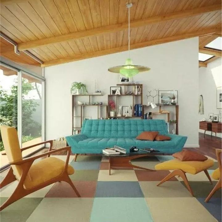
Photo Thrive Furniture
Today, the midcentury look is just about everywhere - and I’d bet that most of the time you don’t even notice it. The recent TV show Mad Men is a bit more obvious of an example, but just about any living space on TV or in the movies from college dorm rooms to suburban living rooms and penthouse apartments will have a Womb Chair by Saarinen or a classic fiberglass Eames rocker (don’t even get me started on how college students can afford these treasures #jealous). Commercials use fun, multi-colored Eames molded side chairs to lend the ease of clean lines and a sense of familiarity to their spots. Flip through design magazines or scroll through interior design photos on Pinterest and hints of midcentury are everywhere. Retailers like West Elm and Thrive Furniture are playing with midcentury looks too - opening the design style to a whole new generation of consumers.
So, what does “Mid Century Modern” actually mean? The simple definition is furniture, architecture, and graphic design created from 1933 to 1965. The phrase “midcentury modern” was coined in 1984 by Cara Greenberg in her book, Midcentury Modern: Furniture of the 1950s. The style’s design elements include clean lines, geometric designs, natural curves, wood, metal, and bright colors.

Photo: Casa Abril
So, why is midcentury still so popular and familiar? After all, it’s been over 60 years since the era was in full swing. In short, midcentury pieces are clean-lined, well-designed, and have a timeless look, so they can easily be peppered into lots of spaces. They still feel modern today. With the trend toward urban living we can only expect midcentury to stay around. The designs are perfect for smaller spaces, are generally lightweight for those who move frequently, and lend a sense of familiarity to every space they’re in.

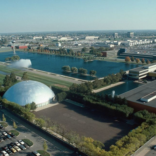
Ciseal Roots: The GM Tech Center
I wasn't always a design fan - in fact, I studied engineering first thinking I should be responsible and have a "real job." Little did I know that that "real job" would lead me on a path towards becoming one of those artist types who gets to have fun and make things every day.
My path to this point of making bent plywood things for a living all started when I got my first real job at the GM Technical Center in Warren, MI. At the time, I didn't have a clue about this mid century architecture and landscape design mecca. Little by little, though, the design bug began to emerge as I was surrounded by the purposeful yet beautiful vintage architecture, interior design, and landscaping.

The vision for the Tech Center was that of GM's head of research from 1920 to 1947 Charles Kettering. He insisted of the campus' architect Eero Saarinen that it wasn't to be a fancy facility. Kettering wanted solid, streamlined buildings that would encourage innovative thinking. When naming the Tech Center a National Historic Landmark in 2014, The U.S. Interior Department and National Park Service noted, "The General Motors Technical Center (commonly known as the “GM Tech Center”) is one of the most significant works of architect Eero Saarinen...The GM campus represents Saarinen’s work not just as a creator of buildings but also as the planner/designer of total environments."

What piqued my interest was the variety of buildings and features that were designed over 70 years ago, but have remained intriguingly modern. Things like the staircases that appear to float down from the floor above, the brightly colored glazed bricks that keep the thermal load of the buildings low, the design dome which is the most awe inspiring space to see a concept car, and the lobbies that have so many details that you could spend hours in them and not catch it all.


(All photos from the Library of Congress)


